


For decades, words have been lawyers’ tools of trade. Today, we should no longer let tradition force us to think inside the text-only box. Apart from words, there are other means available.
It is no longer enough (if it ever was) to offer more information or to enhance access alone: the real challenge is the understandability of the content. We might have access to information, but still be unable to decode it or realize its importance. It is already painfully clear that the general public does not understand legalese, and that communication is becoming more and more visual and rapid. There is a growing literature about style and typography for legal documents and contracts, yet the use of visual and non-textual elements has been so far omitted for the most part. Perhaps images do not seem “official”, “legal”, or trustworthy enough for all.
Last year, in Sean McGrath’s post on Digital Law, we were alerted to what lawyers need to learn from accountants. In this post, we present another profession as our role model, one with a considerably shorter history than that of accountants: information designers.
Focus on users and good communication
Lawyers are communication professionals, even though we do not tend to think about ourselves in these terms. Most of us give advice and produce content and documents to deliver a specific message. In many cases a document — such as a piece of legislation or a contract — in itself is not the goal; its successful implementation is. Implementation, in turn, means adoption and action, often a change of behavior, on the part of the intended individuals and organizations.
Law school does not teach us how to enhance the effectiveness of our message. While many lawyers are known to be good communicators, most have had to learn the hard way. It is easy to forget that our colleagues, members of the legal community, are not the only users of our work. When it comes to other users of our content and documents, we can benefit from starting to think about 1) who these users are, 2) what they want or need to know, 3) what they want to achieve, 4) in which situation, and 5) how we can make our content and documents as clear, engaging and accessible as possible.
These questions are deeply rooted in the discipline of information design. The work of information designers is about organizing and displaying information in a way that maximizes its clarity and understandability. It focuses on the needs of the users and the context in which they need to find and apply information. When the content is complex, readers need to grasp both the big picture and the details and often switch between these two views. This is where visualization — here understood as adding graphs, icons, tables, charts and images to supplement text — enters the picture. Visualization can help in navigating text, opening up its meaning and reinforcing its message, even in the field of law. And information design is not about visualization only: it is also about many other useful things such as language, readability, typography, layout, color coding, and white space.
Want to see examples? Look no further!
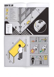
Figure 1: Excerpt from Vendor Power! – a visual guide to the rights and duties for street vendors in New York City. © 2009 The Center for Urban Pedagogy.
A convincing example of visualizing legal rules is “Vendor Power!”, a work carried out by a collaboration of the Center for Urban Pedagogy, the designer Candy Chang, and the advocacy organization the Street Vendor Project. After noting that the “rulebook [of legal code] is intimidating and hard to understand by anyone, let alone someone whose first language isn’t English”, the project prepared Vendor Power!, a visual Street Vendor Guide that makes city regulations accessible and understandable (Figure 1). The Guide presents key information using short sentences in five languages along with diagrams illustrating vendors’ rights and the rules that are most commonly violated.
In the UK, the TDL London team turned recent changes in the rules related to obtaining a UK motorcycle licence into an interactive diagram that helps its viewers understand which motorcycles they are entitled to ride and how to go about obtaining a motorcycle licence. In Canada in 2000, recognizing the need for new ways to improve public access to the law, the Government commissioned a White Paper proposing a new format for legislation. The author, communication designer David Berman, introduced graphic design methods and the concept of using diagrams to help describe laws. While creating a flowchart diagram, Berman’s team revealed inconsistencies not accounted for in the legislation, suggesting that if visualization was used in the drafting process, the resulting legislation could be improved. One of the authors (the designer) can confirm this “logical auditing” power of visualization, as similar information gaps were promptly revealed by visualizing through flowcharts the Finnish General Terms of Public Procurement in Service Contracts, during the PRO2ACT research project.
Not only have designers applied their talent to legal information; some lawyers, like Susanne Hoogwater of Legal Visuals and Olivia Zarcate of Imagidroit, and future lawyers, like Margaret Hagan of Open Law Lab, have turned into designers themselves, with some remarkable results that you can find on their websites.
Legal visualization may deal with data, information, or knowledge. While the former two require software tools and coding expertise in order to generate images that represent complex data structures (an example is the work of Oliver Bieh-Zimmert who visualized the network of paragraphs and the structure of the German Civil Code), knowledge visualization tends to use a more ‘handcrafted’ approach, similar to how graphic designers rather than programmers work. The authors of this post have relied on the latter when enhancing contract usability and user experience through visualization, utilizing simple yet effective visualizations such as “metro maps” (Figure 2), timelines, flowcharts, icons and graphs. More examples of the work, carried out in the FIMECC research program User Experience & Usability in Complex Systems (UXUS), are available here, while our most recent paper, Transforming Contracts from Legal Rules to User-centered Communication Tools, published in 2013 Volume I Issue III of Communication Design Quarterly Review , discusses how greatly visualization can contribute to the user-centeredness of contracts.
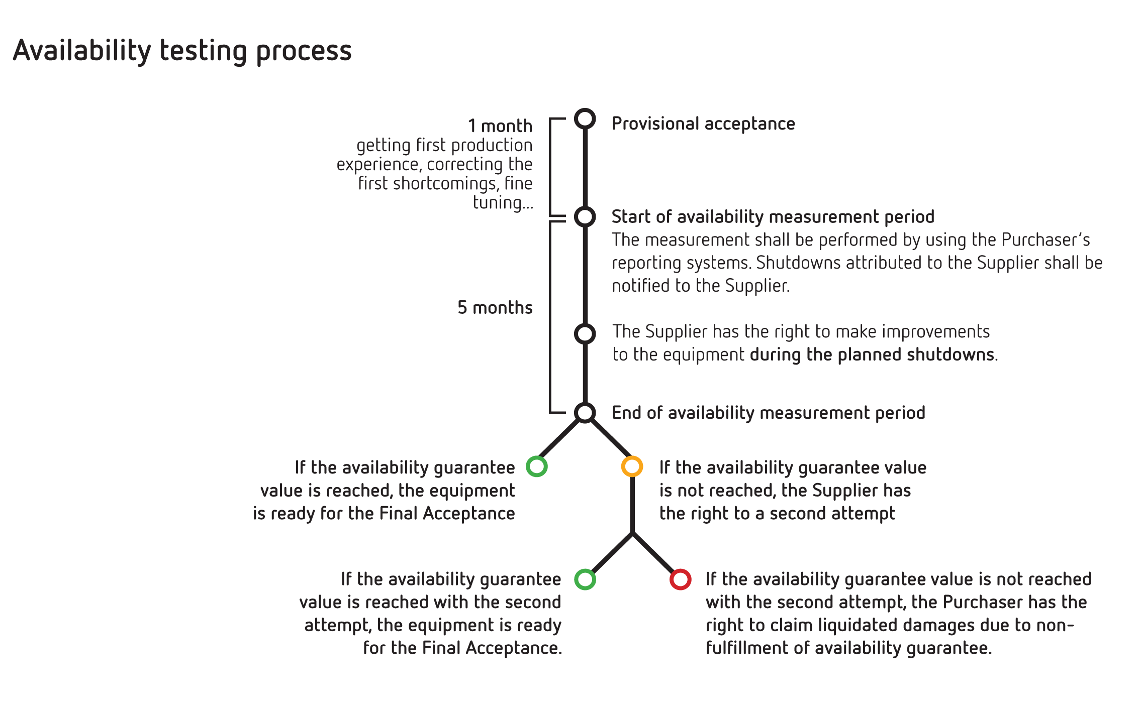
Figure 2. Example of a “metro map” that explains the process of availability testing, as described in an agreement on the purchase of industrial machinery and equipment. © 2012 Aalto University. Author: Stefania Passera.
When teaching cross-border contract law to business managers and students, one of the authors (the lawyer) has also experimented with graphic facilitation and real-time visualization, with the aim of curing contract phobia, changing attitudes, and making contracts’ invisible (implied) terms visible. Examples of images by Annika Varjonen of Visual Impact are available here and, dating back from 1997, here.
The Wolfram Demonstrations Project illustrates a library of visual and interactive demonstrations, including one contributed by Seth Chandler on the Battle of Forms that describes the not-uncommon situation where one company makes an offer using a pre-printed form containing its standard terms, and the other party responds with its own form and set of standard terms. The demonstration allows users to choose various details of the case, with the output showing the most likely finding as to whether a contract exists and the terms of that contract, together with the arguments that can be advanced in support of that finding.
In the digital world, Creative Commons licenses use simple, recognizable icons which can be clicked on to reveal a plain-language version of the relevant text. If additional information is required, the full text is also available and just one click away. The information is layered: there is what the authors call the traditional Legal Code (the “lawyer readable” version), the Commons Deed (the “human readable” version, acting as a user-friendly interface to the Legal Code), and the “machine readable” version of the license. A compilation made by Pär Lannerö in the context of the Common Terms project reveals a number of projects that have looked into the simplification of online terms, conditions and policies. An experiment involving icons was carried out by Aza Raskin for Mozilla. The set of Privacy Icons developed by Raskin can be used by websites to clarify the ways in which users of the website are agreeing to allow their personal data to be used (Figure 3).
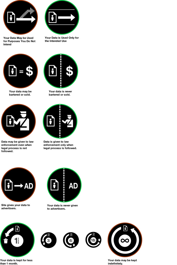
Figure 3. Examples of icons used for the rapid communication of complex content on the Web: Mozilla Privacy Icons by Aza Raskin. Source: flickr.com. Image released under a CreativeCommons licence CC BY-NC 2.0
In Australia, Michael Curtotti and Eric McCreath have worked with enhancing the online visualization of legislation, and work is currently in progress on the development of software-based tools for reading and writing law . This work has grown out of experience in contract drafting and the drafters’ needs for practical software tools. Already in 2001, in their ACCA Docket article Doing deals with flowcharts, Henry W. (Hank) Jones and Michael Oswald recognized this need and discussed the technology tools available to help lawyers and others to use flowcharts to clarify contractual information. They showed examples of how the logic of contract structure, the actors involved, and clauses such as contract duration and indemnification can be visualized, as well as explaining why this should be done.
In the United States, the State Decoded (State codes, for humans) is a platform that develops new ways to display state codes, court decisions, and information from legislative tracking services. With typography, embedded definitions of legal terms and other means, this project aims to make the law more easily understandable. The first two state sites, Virginia and Florida, are currently being tested.
Recently, visual elements have even made their way into court decisions: In Sweden, a 2009 judgment of the Court of Appeal for Western Sweden includes two timeline images showing the chain of events that is crucial to understanding the facts of the case. This judgment won the Plain Swedish Crystal 2010, a plain language award. In the United States, an Opinion by Judge Richard Posner of the Chicago-based 7th U.S. Circuit Court of Appeals uses the ostrich metaphor to criticize lawyers who ignore court precedent. Two photos are included in this opinion: one of an ostrich with its head buried in the sand, another of a man in a suit with his head buried in the sand.
Want to learn more and explore? Read this – or join one of our Design Jams!
In Central Europe, the visualization of legal information has developed into a research field in its own right. In German-speaking countries, the terms legal visualization (Rechtsvisualisierung), visual legal communication, visual law and multisensory law have been used to describe this growing field of research and practice. The pioneer, Colette R. Brunschwig, defended her doctoral thesis on the topic in 2001, and has since published widely on related topics. She is the leader of the Multisensory Law & Visual Law Community at beck-community.
In his doctoral research related to legal risks in the context of contracts at the Faculty of Law in the University of Oslo, Tobias Mahler used icons and diagrams illustrating legal risk and developed a graphical modeling language. In a case study he conducted, a group of lawyers, managers, and engineers were asked to use the method to analyze the risks connected with a contract proposal. The results showed that the diagrams were perceived as very helpful in communicating risk.
At the Nordic Conference of Law and IT, “Internationalisation of law in the digital information society” in Stockholm in November 2012, visualization of law was one of the three main topics. The proceedings, which include visual law related papers by Colette R. Brunschwig, Tobias Mahler and Helena Haapio, will be published in the forthcoming Nordic Yearbook of Legal Informatics (Svantesson & Greenstein, eds., Ex Tuto Publishing 2013).
Furthermore, the use of visualizations has been studied, for example, in the context of improving comprehension of jury instructions and in facilitating the making of complex decisions connected with dispute resolution. Visualization has also been observed in the role of a persuasion tool in a variety of settings, from the courtroom to the boardroom. After Richard Sherwin debuted Visual Persuasion in the Law at New York Law School and launched the Visual Persuasion Project website , it has become easier for law schools to teach their students about visual evidence and visual advocacy. It is no longer unusual for law teachers or students to use flowcharts and decision trees, and the list goes on. A Google search will reveal the growing number of such applications in law.
If instead of reading you prefer learning by doing, there are some great opportunities later this year. The Simplification Centre and the University of the Aegean will run an international summer/autumn Course on Information Design 30 September to 4 October 2013 in Syros, Greece. Provided that there is enough interest, we plan to arrange 1) special sessions on merging contract/legal design with information design and visualization; and 2) a Legal Design Jam, modeled on hackathons, with a small committed group of interested people, including legal and other practitioners and graphic designers, aiming at giving an extreme visual makeover to a chosen text or document (piece of legislation, contract, license, terms and conditions, …). If you are interested, please contact the organizers at info(at)simplificationcentre.org.uk.
On 8 October 2013, the International Association for Contract & Commercial Management (IACCM) will hold its Academic Forum in Phoenix, Arizona. The conference topics include legal visualization as it relates to commercial and contract management. If you are interested in submitting a proposal for a presentation or a paper, there is still time to do so: the deadline is 1 July 2013. Please see the Call for Papers for details. If we can find a host and a group of committed professionals, scholars and graphic designers, we are also planning to put together a Design Jam right before or after the IACCM Americas Forum on a US location to be agreed. The candidate document for redesign is still to be decided, so please send us your suggestions! If you are interested to host or to participate, please contact either of us at the email address below to express interest, ask questions, or give suggestions.
What does the future hold?
We see these steps as just the beginning. Once the visual turn has begun, we do not think it can be stopped; the benefits are just too many. As lawyers, we have a lot to learn and we could do our job better in so many respects if we indeed started to get into the mode of thinking and acting like a designer and not just like a lawyer. This applies not only to purely legal information, but everything else we produce: contracts, memos, corporate governance materials, policies, manuals, employee handbooks, and guidance.
Legal information tends to be complex, and information design(ers) can help us make it easier to understand and act upon. The goal is accomplishing the writer’s goals by meeting the readers’ needs. We can start to radically transform legal information following the footsteps of Rob Waller’s team at the Simplification Centre by applying What makes a good document to legal documents.
With new tools and services being developed, it will become easier to convey our content and documents in more usable and more engaging ways. As the work progresses and new tools and apps appear, we are likely to see a major change in the legal industry. Meanwhile, let us know your views and ideas and what you are doing or interested in doing with visuals.
 Helena Haapio is International Contract Counsel for Lexpert Ltd based in Helsinki, Finland. Before founding Lexpert she served for several years as in-house legal counsel. She holds a Diploma in Legal Studies (University of Cambridge) and a LL.M. (Turku). She does research on proactive contracting, user-centered contract design and visualization as means to enhance companies’ ease of doing business and to simplify contracting processes and documents as part of her Ph.D. at the University of Vaasa, where she teaches strategic business law. She also acts as arbitrator. Her recent books include A Short Guide to Contract Risk (Gower 2013) and Proactive Law for Managers (Gower 2011), co-authored with Professor George Siedel. Through visualization, she seeks to revolutionize the way contracts and the law are communicated, taught, and perceived. Helena can be contacted at Helena.Haapio(at)lexpert.com.
 Stefania Passera is a researcher in MIND Research Group, a multidisciplinary research team at Aalto University School of Science, Helsinki, Finland. She holds a MA in graphic design (Aalto University School of Art, Design and Architecture), and has been doing research on the usability and user experience of information visualizations in contracts as part of her Ph.D. The leitmotiv of her work is to explore how design and designers can contribute to new multidisciplinary endeavors and what value their way of thinking and doing bring to the mix. Stefania has been collaborating with private and public organizations in Finland on the development of user-centered visual contract documents since 2011.
Stefania can be contacted at stefania.passera(at)aalto.fi
VoxPopuLII is edited by Judith Pratt. Editors-in-Chief are Stephanie Davidson and Christine Kirchberger, to whom queries should be directed.