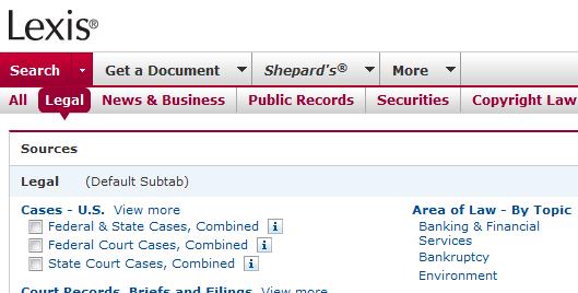
 If you have signed on to Lexis recently, you’ve likely noticed a new look. Like Westlaw, Lexis is currently in a period of change. Later this year, Lexis will roll out a new platform to compete with WestlawNext. But recently, Lexis has adjusted the interface of their current platform to make it more user-friendly and eye-appealing. The interface uses crisper lines, fewer colors, and even more white space than the previous interface. A change that many will appreciate is the reduction in the number of tabs running along the top of the page. The most important tabs—Search, Get a Document, and Shepard’s—still appear; however, the many other available features are now tucked under a tab labeled “More.” This is a great improvement.
Both the Recently Used Sources and Search by Topic or Headnote features have been moved to the right side in their own boxes. This change achieves the dual goal of reducing clutter while making these features more prominent. Also on the right side one sees Quick Tools, which allows users to quickly pull up documents, Shepardize, locate a source, or use the Lexis web with a single search box. The right side also includes an Emerging Issues section highlighting articles posted by practitioners in an array of practice areas. Overall, the changes Lexis has made are for the better. In time, we will see what their answer is to WestlawNext.


