


VoxPopuLII
(c) Fred Leichter, 2014.
1. Bringing communication design to law
In May 2014, we ran a Legal Communication Design class at Stanford’s Institute of Design, or the d.school. Though legal communications have a reputation as dense, opaque & heavy, we wanted to open up some space for experimenting with what legal communication could be. The d.school proposes that professionals solve problems through collaborative, interdisciplinary experimentation, all while focused on building solutions that are user-friendly & engaging for specific end-users.
We decided to take this approach and apply it to legal communications. Our goals were twofold:
- to train students in how to communicate complex information to lay audiences, and
- to scope new patterns and models for more resonant communication design of information that conveys legal terms & conditions, rights and warnings.
We formed a three-person teaching team: Margaret Hagan, a legal designer based at Stanford’s d.school; Alex Gavis, in-house counsel at Fidelity Investments with expertise in consumer and financial regulations and product design; and Kursat Ozenc, an interaction designer trained at Carnegie Mellon’s Design School and working at Autodesk.

We developed a two-day intensive “Pop Up” class at the d.school entitled, “Get Smart: Marking Complicated Information Simple.” We intended for the class to be mostly populated by law students, but most of our applicants came from students studying in other fields: engineering, management science, business, political science, and anthropology. The class was oversubscribed, and ultimately limited to about 45 students.
2. Our approach to complex communication design
The pop-up class was an experiment to see what ideas would emerge from interdisciplinary groups of students using design to make complex legal information more comprehensible. As we prepared for the class, we began to form a Framework of Complex Communication Design. Our central insight is that complex information design can be categorized into two basic branches: (1) that for analysis and understanding, and (2) that for decision-making and action.
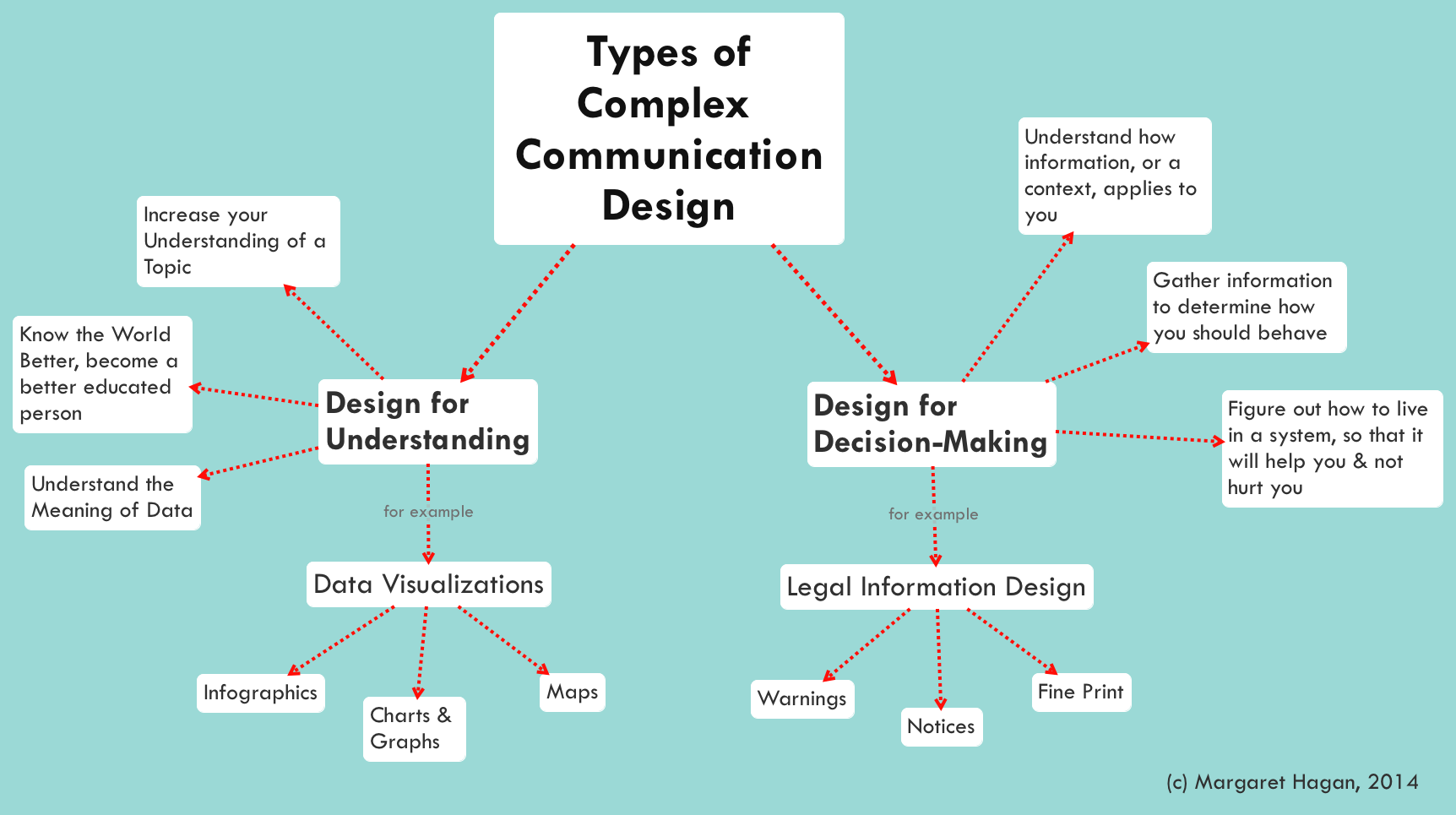
Communication Design for Insight and Understanding
The first categorization can be described as making complex sets of information more understandable. There is considerable buzz around this type of complex communication design right now, especially around “data visualizations”. This type of design draws on data sets underlying complex sets of facts, and it attempts to present the data sets in a lively and engaging matter.
In this branch of complex communication design, the goal is to educate. It is to shape data that is otherwise overwhelming into information that is digestible and attractive, and it helps the user understand the data and information. Ideally, the design will allow its author to convey large data sets for better comprehension by individuals — helping them to see patterns, trends, and meaning in an otherwise opaque set of information. The design might also be interactive and flexible enough to allow its end-user to find new insights and inspirations about the data topic, which the design’s author was not aware of.
This type of communication design is commonly employed by scientists, journalists, and others who want to help people make connections between large data sets and the broader world.
Communication Design for Decision-Making
The second stream of communication design is about making complex rules and systems both comprehensible and actionable. It applies to legal communications of notices, rights and warnings. Done well, this type of complex design has the author presenting the rules of a system in their complexity, but empowers the end-user to navigate this complexity — giving them an understanding of the rules and the ability to apply them to the user’s specific situation and decisions.
The goal here is not so much about analysis, like in the first branch, but rather in as helping people make better decisions for themselves. It is about helping people understand the situation that they are in, what rules apply to them, what the consequences of these rules will be, and what kind of behavior to take in response to these rules.

This type of communication design is a legal design challenge. It is focuses on helping people understand the rules of the world and applying the rules to their own life. It is not education for education’s sake. It is practical, but also quite challenging.
In practice, though legal communication design should apply directly to people’s lives, it does not. The standard for this branch of design is currently low, if we look at the way terms and conditions are presented in consumer contracts, or the legal fine print at the bottom of television advertisements, or the privacy policies on websites. Most often the communications as presented are dense, jargon-laden, and pedantic. They do not provide the user with greater comprehension of the rules, nor do they empower better decision-making.
Our Focus
Accordingly, our goal for the class was to focus on this second category of communication design. We intended to apply user-centered, experimental design process to explore what types of communication could lead to more user engagement, comprehension, and better decision-making.
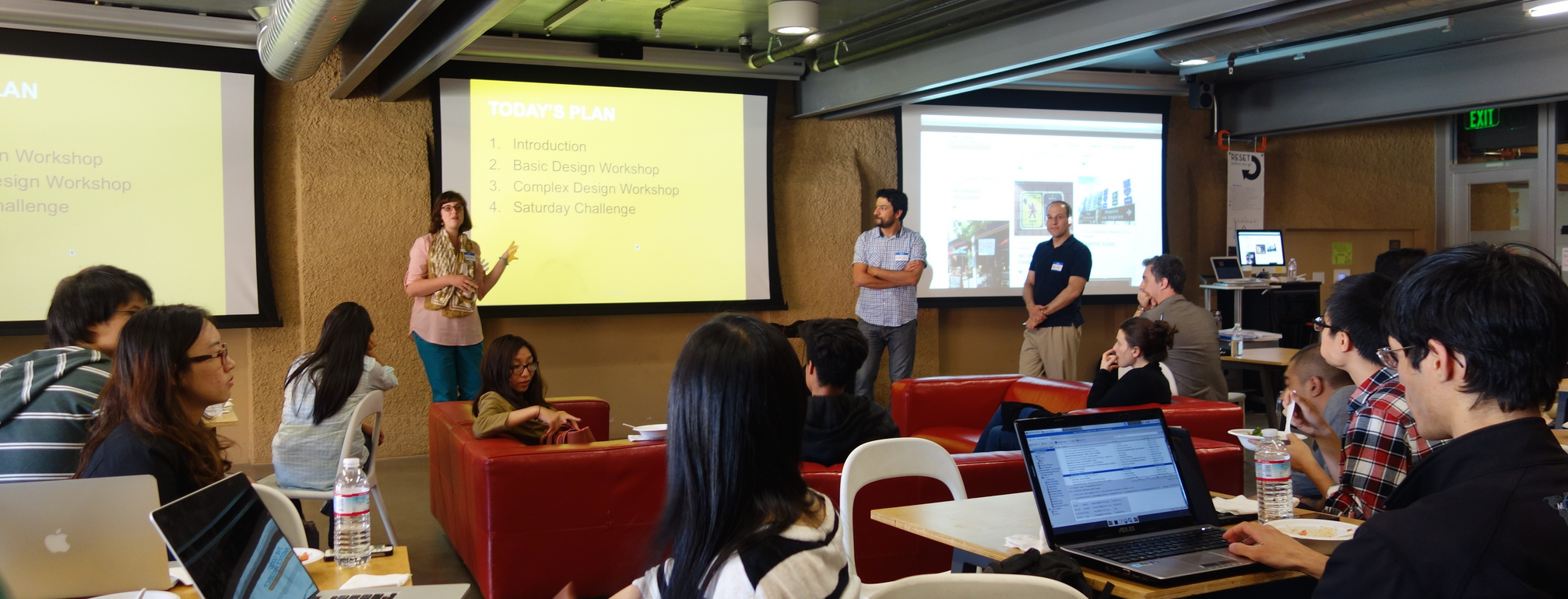
3. The Class
The d.school class was held over two days: the first day was an evening boot-camp in visual and communication design, followed by a second day “design sprint” to create and test complex legal communication designs in response to specific use-cases we created.
We created the boot-camp to be a staged training. We first taught the basics of good information design. Then, we scaled this knowledge to review complex information design techniques. After this two-staged boot-camp, the next day was an eight-hour session, during which students were challenged to apply what they learned in the first day to legal use-cases.
The Design Bootcamp
Our challenge in the bootcamp was to to cover the basics of quality communication design to a student audience relatively un-versed in design, within a very restricted time. We decided to do a mixture of learning-by-doing and learning-by-exposure. We also created and distributed “cheat-sheets” covering the basic principles of communication design, blended with tips, templates, and suggestions.
We introduced the fundamental Gestalt principles of visual design (i.e., hierarchy, proximity, asymmetry), and then we showed examples of effective and ineffective design.

Kursat Ozenc explains visual design principles through examples. (c) Fred Leichter 2014.
Prior to the class, we had asked students to post examples of complex communication design to our class website. We drew on these student-sourced images for in-class discussion, and our teaching team also scouted images that could demonstrate the fundamental principles. The examples of visual design ranged from those intended to educate, to those meant to delight or intrigue. We mixed in very practical graphics with those with innovative visual cues and illustrations.
Immersing students in many forms of communication design helped to demonstrate design principles in a way that verbal descriptions could not. The examples also provided good inspiration material for the teams to use, when trying to decide how to convey a message, or to synthesize data points into meaningful relationships. Our teaching strategy was to provide the students with a broad portfolio of types of design, so they could see for themselves why certain designs work or do not, and that they could borrow from the designs that engaged them as a user.
We next took the class through a series of short, 20-minute design exercises, to help them build their design muscles for use the next day. First, we asked students to design a flyer invitation to their next birthday – keeping them focused on how to make a convincing communication within space constraints. This was to practice their understanding of basic principles of good composition, messaging, color choice, and imagery.
Next, we ran a more legal design exercise, in which the students had to represent the complex text instructions for using a transit card in a usable way. The goal was to make these terms and conditions into a user-friendly, contextual communication that a user could actually use during their commute to avoid fines.

A quick design to convey a Transit Card’s rules to a commuter.
With each of these exercises, students worked by themselves for a short period, and then presented their work to the group. The design reviews provided some critical feedback, as well as encouragement for good design work. These short exercises were warm-ups and team building for the next day’s design sprint.
The Legal Communication Problem and Use Cases
On the second day, the class shifted focus from good communication design practices to the challenges of legal design. Alex began the day with a discussion of why good legal communications design matters. While the law does not require that contracting parties read an agreement, there must be a meeting of the minds. Reasonable processes for obtaining consumer acknowledgement or consent in online agreements are upheld by courts. It takes a lot of bad facts to unwind a contract as unenforceable.

Alex Gavis presents the challenges lawyers face when trying to design legal communications to customers. (c) Fred Leichter 2014.
Some laws are proscriptive to protect the public (e.g., the securities laws on full and fair disclosure) others are principles based (e.g., consumer protection laws prohibiting unfair and deceptive acts), and some are structured to validate legitimacy of actions (e.g., the federal and state electronic signature laws).
All this leads to legal dissonance on how consumers may be treated when in transacting online for goods or obtaining services. They generally make purchase decisions not based on any awareness of terms or conditions or the “fine print.” They are confronted with contracts, terms-of-use, consents, and disclosures all over the place, but they typically do not take action on them (click, acknowledge, accept) until after making a decision — usually only upon checkout.
The requirements to make these legitimate in the law can vary by law, regulation, and jurisdiction. Many transactions or interactions wind up in the category of “agree now, worry later” for consumers.
Communications in which the message is well-crafted and the visual is well-rendered can help understanding and mitigate later problems. If there is understanding at the beginning of the consumer-commercial relationship, then there may be less at risk for both parties. Good design and communications may lead to better outcomes as both parties understand what is being asked and required of them and later disputes may be mitigated or dampened.
We assembled four use cases to demonstrate the importance of good communications design.
Use Case 1: “And Where Do I Sign?”
 The first use case mentions a fictitious consumer, Susan, who spends a lot of time researching and connecting with friends about where to put her money. She makes a decision and is eager to open an account quickly at the financial institution she has chosen.
This is where the road gets bumpy for her as she must suddenly navigate disclosures, notices, consents, agreements and the providing of personal information. This mishmash of activity occurs before she can successfully open an account, and she thinks that somewhere in all that language is something that she may wish she had known and understood.
Students were assigned to consider these facts and determine how to design a different experience that would engage and inform (and perhaps delight) Susan.
Use Case #2: “I am on the Run, Just Tell Me What to Do.”
 The second use case involved a similar fact scenario to the first one, but asked students to imagine that Susan is a busy executive who travels all over the U.S. She has a small window of time in which to open an account one day and must do so at the airport between flights.
The students’ assignment was to design a successful (and delightful) experience for Susan that can work with her mobility.
Use Case #3: “When Can I Play?”
 The third use case involved a father–son interaction. Carlos wants to help his young son download an online game. The gaming company has agreements, notices, and terms and conditions that it needs Carlos to agree to before it will allow for the downloading of the game. Some of the conditions are required by law; some are required by the company to protect its intellectual property; and some may be required by the credit card company that is handling the billing.
The students’ assignment was to consider how Carlos, in the process of obtaining information and accepting a free trial, can understand the various rights and responsibilities that he (and his son) will be taking on, including license and intellectual property rights, the conditions and responsibilities for payments and the policies and regulations regarding his and his son’s privacy preferences. They were to design an experience that would allow Carlos to understand better what is involved, and from the standpoint of Carlos completing it online through a mobile device with limited print and storage capabilities.
Use Case #4: “You Want Me to Say What?”
 The final use case involved an example of advertising for financial services. Advertising provides a source of information to prospective customers about the products and services offered by financial services firms. Advertisers desire to keep the messaging in advertisements streamlined and straightforward, while at the same time making compelling messaging that will be understood by consumers and complying with regulatory standards.
The students were tasked with conjuring advertising across print, web, mobile and television that can meet the twin goals of being innovative in messaging while adhering to specific regulatory disclosure requirements. The students were provided with examples of the disclosure requirements and were asked to find ways to innovate with the display and positioning of required disclosures. They were challenged to discover new concepts in advertising design to meet the goals of understandability, simplicity and investor understanding.
The Design Sprint
We formed the students into teams, mixing their disciplines to get a balance of law students, engineers, social scientists, and humanities students in each group. Then each group was able to choose which use case they wanted to work on.
With their use case chosen, the teams first worked to flesh out a persona in each case, around which to design and build their models. Next, the teams evaluated the type of information that the use-case required to be presented to the persona-audience. After that, they brainstormed design ideas, about what kinds of communications may engage their persona.
Once they developed ideas, the teams discussed their practicality and, in some cases, the groups voted on which one (or ones) to pursue. With this focus, they then spent an hour designing a prototype of the communication design to test in the field. Some created visuals by hand, others used digital tools to mock-up storyboards, app interfaces, or graphics.
After lunch, they went out onto the Stanford campus to find user testers. They asked members of the public for feedback on their ideas and design. Finally, in the last hour of the workshop, each team presented their final designs and user feedback to the class.
4. Models that Emerged
We found that the students generated ideas that suggest several different models for how to provide notice in a legal situation.
Model 1: Embedded Notice
This model involves embedding information concerning warnings into the context of the content that the user desires to consume.
For a television advertisement, for example, one team proposed that, instead of presenting images and voice together and then the legal disclosures (in “fine print” text) in a separate overlay, the message(s) from the legal disclosures could be woven into the images and the voiceover. This would allow a customer to comprehend the “fine print” information within the visual and aural content experience, without having to strain to read the disclosure text on screen.
For Use Case #3, one team suggested that the privacy disclosures and other legal warnings be incorporated into the game environment. The same avatars, background, points system and interfaces would exist for the game and for the disclosures. They suggested an approach where a game user goes through the disclosures and wins points, advancing in the game universe.

(c) Margaret Hagan 2014
This allows the user to become educated on privacy and legal issues in the context of what he or she wants to do – play the game. It cleverly embeds the disclosures and warnings directly into the game flow.
The overall model has the legal and financial notice woven together with the juicy and non-legal content.
1a: Interactive Games
One popular type of an embedded notice was game-based. Several teams built models around games, putting the information into a highly interactive and rewarding type of situation.
As discussed with the class, a drawback with this model is that it is very intensive, requiring an investment of time from the user as well as from the notice giver. A benefit is that it has a narrative that can be quite engaging. It has stages and incentives to keep exploring the information being communicated.
This model might work very well when the user is already within a digital environment, like a game on a computer or on an app. The notice-game can be woven seamlessly into the experience that the user is trying to enjoy. It should be considered for “entertainment experiences,” when the user is already in an entertainment mode — for example, when he or she is about to play a game, watch a movie, read a magazine, or start a video game.
Model 2: Roadmap with Zoom
This model involves a large map of the notice and message, which the user can then zoom in and out of. The user chooses where to focus, and can see both the complexity all at once from a distance, or zoomed into a particular part of it.
This type of design allows the user to engage with the material selectively and in a staged way. The omniscient user sets the terms.

(c) Margaret Hagan 2014
Two different teams presented designs along this model, but with slight variations. In one model, the designer of the communication sets a sequential path through the communication, and the user goes step by step through it.
The second model is non-sequential and non-linear. The user browses through the communication, zooming in and out of particular topics and choices. The design tracks the progress they have made, but it does not strictly guide the user along a certain path.
Model 3: Divide & Conquer
The divide and conquer model is a modular series of communications that add up to a complete, complex delivery of notice. It involves a modular, staged set of discrete “communication tasks,” that the user proceeds through at their own pace.
The user receives a short communication and then must respond in some way to show that she has registered the information. Each communication is a task, with a two-way channel, of the designer presenting information to the user and the user having to respond in some way. The user goes through the communication tasks one by one, completing the stages and eventually getting the entire communication.
This model takes inspiration from a checklist, but it gives a focused experience for each task. It also lets the user do things in a short way, knowing how much time each of these modules should take and then conquering what they want depending on their situation at the time.
3a: The efficient, clean click-through
One example of this model was more for a professional user, who values efficiency and practicality. The design’s goal was to provide an interactive app that would efficiently let the professional target and flag important information. It was an even more streamlined version of Divide & Conquer, for people who don’t want to dive into any details.
This model allowed for having the details sent later through email or reminders, for when the user may want to refer to the full text. It generally prioritized quick understanding over deep comprehension, but tried to give enough understanding to alert a user to anything she may be concerned about or may want to explore at a later time.
Model 4: Personalized, Conversational, Growing Agreement
In this design, the user responds to prompts, asking him for his information and preferences. As he responds to each prompt, a customized communication is generated for him. It is presented alongside his responses, so he can see how the contract, notice, or other type of legal communication will change depending on his answers.

(c) Margaret Hagan 2014
The legal notice is not a given, but rather is progressively generated by the user. The motive behind this model is to give the user a sense of authorship and control. The user is able to see how his choices affect the length and complexity of provisions of the agreement that he must accept at the end of the process. There is a dynamic nature to this process as paragraphs build or collapse depending upon actions. It is also to show flexibility from the designer and legal communicator — to let them show they are willing to defer to the preferences of the user. The experience becomes one that is constructive.
Model 5: Proximate, Contextual Notification
In the proximate notice design, the legal communication is divided up into stages and then presented to the user as it relates to the topic at hand.
It was designed with the idea of presenting terms and conditions selectively, as it relates to the user’s specific data disclosures. As the user enters data into a field, the design immediately prompts her with what the rules, restrictions and notices are for that piece of information. The user sees the conditions as applied to each data point individually.
The design intends to make the large, complex set of terms and conditions more understandable by contextualizing them, and by presenting them bit by bit. The model ideally helps the user understand concretely how each piece of information she discloses relates to the terms and conditions.
Model 6: Protector Relationship
In the protector model, the design attempts to put the user in the mindset of protecting another person, or a future version of themselves. It may do this through the use of an avatar, who will be affected by the content of the communication. Or it could be through a design that shows the user a future version of herself, and encouraging her to think of the communication as applied to this future version.
The goal is to encourage more engagement with a legal communication by putting the user in the position of protecting someone else. Rather than passing over legal information, the user will invest attention into it because something is at stake for someone else. It taps into a sense of duty to protect, especially for someone who seems vulnerable.
This model of design attempts to facilitate more thoughtfulness about the legal communication — helping the user think about how it will play out over a long term. It may also encourage users to think of cause and effect.
5. Ways Forward
The ideas that emerged were bounded by the limited one-day timing for the class. With more time, we are confident that additional ideas would be born. It was helpful to have a mixture of law, business, engineering, and students in other disciplines participating in the class, as they brought varied ideas to the table.
Now we are planning a follow-up workshop with a more specific group of participants: lawyers who work on legal communication challenges like those in our use cases, and designers who have an interest in engaging, resonant communications. Our plan is to take the models and prototypes that emerged out of the class, and to work with the lawyers and designers to validate or upend these initial drafts. We hope to hone a more definite set of good legal communication design patterns, which can be useful to those making complex information design.
After this next-stage workshop, we are considering a controlled test of several of the most promising concepts to determine whether they have the desired effect of making contracting more understandable and simpler. We could imagine these ideas being tested in any number of different contexts where a business would like its users to agree to specific conditions or agreements. This also could be the subject of psychology research and studies on the propensity for individuals to understand information that is designed for their consumption.
The class confirmed for us that there are design approaches — some of which our class developed and others yet to be found — that can directly address complexity in legal interactions and that may well resonate.
About the Authors
 Alex Gavis is a member of the Corporate Legal Department of FMR LLC, the parent company of Fidelity Investments, one of the largest brokerage and mutual fund companies in the United States and the leading provider of workplace retirement savings plans. He manages a team of attorneys and professionals and is responsible for providing legal services to the firm’s retail brokerage, college savings, stock plan and workplace retirement businesses. He also oversees and manages legal services for Fidelity’s businesses involved in electronic and mobile commerce, start-up innovation, and social media. Mr. Gavis also oversees legal advice on all of Fidelity’s national advertising and marketing initiatives. He is frequent speaker and lecturer on securities law and e-commerce issues.
 Margaret Hagan is a fellow at Stanford Law’s Center on the Legal Profession and a lecturer at Stanford Institute of Design (the d.school). She was a fellow at the d.school from 2013-2014, where she launched the Program for Legal Tech & Design, experimenting in how design can make legal services more usable, useful and engaging. She taught a series of project-based classes, with interdisciplinary student groups tackling legal challenges through user-focused research and design of new legal products and services. She also leads workshops to train legal professionals in the design process, to produce client-focused innovation. Her blog on legal design is Open Law Lab, and her portfolio of design projects and illustrations are available here.
 Kursat Ozenc is a Senior User Experience Designer at Autodesk in San Francisco, building the next generation design tools for infrastructure professionals. He conducts user research, turns research insights into concept designs, & transforms designs into launch-ready systems, interactions, and interfaces. He completed his Ph.D. studies (2011) in design at Carnegie Mellon University. He holds an M.F.A. degree (2004) in Visual Communication Design from Sabanci University in Istanbul, and a bachelors degree (2002) in Industrial Product design from Middle East Technical University, Ankara, Turkiye.
Other posts on visualization and law on this blog include Visual Law: What Lawyers Need to Learn from Information Designers by Helena Haapio and Stefania Passera.
VoxPopuLII is edited by Judith Pratt. Editors-in-Chief are Stephanie Davidson and Christine Kirchberger, to whom queries should be directed.
[…] This post was originally posted on the VoxPopulii blog of the Cornell Legal Information Institute. […]
[…] on Cornell’s VoxPopulii Blog, I just posted up a comprehensive write-up on a Legal Communication Design pop-up-class that I had taught with Kursat Ozenc & Alex Gavis at Stanford’s d.school in May 2014. When […]
[…] Hagan, Alex Gavis, and Kursat Ozenc have posted Designing legal communications that resonate, at […]