skip navigation
search

Lessons Gained from Parliamentary Information Visualization (PIV)

The emerging topic of Parliamentary Informatics (PI) has opened up new terrain in the research of the scope, usefulness and contribution of Informatics to parliamentary openness and legislative transparency. This is pretty interesting when visualizations are used as the preferred method in order to present and interpret parliamentary activity that seems complicated or incomprehensible to the public. In fact, this is one of the core issues discussed, not only on PI scientific conferences but also on parliamentary fora and meetings.

The issue of Parliamentary Information Visualization (PIV) is an interesting topic; not only because visualizations are, in most cases, inviting and impressive to the human eye and brain. The main reason is that visual representations reveal different aspects of an issue in a systematic way, ranging from simple parliamentary information (such as voting records) to profound socio-political issues that lie behind shapes and colors. This article aims to explore some of the aspects related to the visualization of parliamentary information and activity.

Untangling the mystery behind visualized parliamentary information
Recent research on 19 PIV initiatives, presented in CeDEM 2014, has proven that visualizing parliamentary information is a complicated task. Its success depends on several factors: the availability of data and information, the choice of the visualization method, the intention behind the visualizations, and their effectiveness when these technologies are tied to a citizen engagement project.

To begin with, what has impressed us most during our research is the kind of information that was visualized. Characteristics, personal data and performance of Members of Parliament (MPs)/Members of European Parliament (MEPs), as well as political groups and member-states, are the elements most commonly visualized. On the other hand, particular legislative proposals, actions of MPs/MEPs through parliamentary control procedures and texts of legislation are less often visualized, which is, to some extent, understandable due to the complexity of visually depicting long legislative documents and the changes that accompany them.

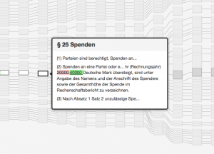
Gregor Aisch – The Making of a Law visualization

Gregor Aisch – The Making of a Law visualization

However, visually representing a legislative text and its amendments might possibly reveal important aspects of a bill, such as time of submission, specific modifications that have been performed, and additions or deleted articles and paragraphs in the text.

Another interesting aspect is the visualization method used. There is a variety of methods deployed even for the visualization of the same category of Parliamentary Informatics. Robert Kosara notes characteristically: “The seemingly simple choice between a bar and a line chart has implications on how we perceive the data”.

In the same line of thought, in a recent design camp of the Law Factory project, two designer groups independently combined data for law-making processes with an array of visualization methods, in order to bring forward different points of view of the same phenomenon. Indeed, one-method-fits-all approaches cannot be applied when it comes to parliamentary information visualization. A phenomenon can be visualized both quantitatively and qualitatively, and each method can bring different results. Therefore, visualizations can facilitate plain information or further explorations, depending on the aspirations of the designer. Enabling user information and exploration are, to some extent, the primary challenges set by PIV designers. However, not all visualization methods permit the same degree of exploration. Or sometimes, the ability of in-depth exploration is facilitated by providing further background information in order to help end users navigate, comprehend and interpret the visualization.

Beyond information and exploration
Surely, a visualization of MPs’ votes, characteristics, particular legislative proposals or texts of legislation can better inform citizens. But is it enough to make them empowered? The key to this question is interaction. Interaction whether in the sense of human-computer interaction or human-to-human interaction in a physical or digital context, always refers to a two-way procedure and effect. Schrage notes succinctly: “Don’t view visualization as a medium that substitutes pictures for words but as interfaces to human interactions that create new opportunities for new value creation.”

When it comes to knowledge gained through this exploration, it is understandable that knowledge is useless if it is not shared. This is a crucial challenge faced by visualization designers, because the creation of platforms that host visualizations and enable further exchange of views and dialogue between users can facilitate citizen engagement. Additionally, information sharing or information provision through an array of contemporary and traditional means (open data, social media, printing, e-mail etc.) can render PIV initiatives more complete and inclusive.

An issue of information representation, or information trustworthiness?
Beyond the technological and functional aspects of parliamentary information visualization, it is interesting to have a look into information management and the relationship between parliaments and Parliamentary Monitoring Organizations (PMOs). As also presented by a relevant survey, PMOs serve as a hub for presenting or monitoring the work of elected representatives, and seem to cover a wide range of activities concerning parliamentary development. This, however, might not always be easily acceptable by parliaments or MPs, since it may give to elected representatives a feeling of being surveilled by these organizations.

To further explain this, questions such as who owns vs. who holds parliamentary information, where and when is this information published, and to what ends, raise deeper issues of information originality, liability of information sources and trustworthiness of both the information and its owners. For parliaments and politicians, in particular, parliamentary information monitoring and visualization initiatives may be seen as a way to surveil their work and performance, whereas for PMOs themselves these initiatives can be seen as tools for pushing towards transparency of parliamentary work and accountability of elected representatives. This discussion is quite multi-faceted, and goes beyond the scope of this post. What should be kept in mind, however, is that establishing collaboration between politicians/parliaments and civil society surely requires time, effort, trust and common understanding from all the parties involved. Under these conditions, PIV and PMO initiatives can serve as hubs that bring parliaments and citizens closer, with a view to forming a more trusted relationship.

Towards transparency?

Most PIV initiatives provide information in a way compliant with the principles of the Declaration on Parliamentary Openness. Openness is a necessary condition for transparency. But, then, what is transparency? Is it possible to come up with a definition that accommodates the whole essence of this concept?

Transparent labyrinth by Robert Morris, Nelson-Atkins Museum of Art, Kansas City (Dezeen)

Transparent labyrinth by Robert Morris, Nelson-Atkins Museum of Art, Kansas City (Dezeen)

In this quest, it is important to consider that neither openness nor transparency can exist without access to information (ATI). Consequently, availability and accessibility of parliamentary information are fundamental prerequisites in order to apply any technology that will hopefully contribute to inform, empower and help citizens participate in public decision-making.
Apart from that, it is important to look back in the definition, essence and legal nature of Freedom of Information (FOI) and Right to Information (RTI) provisions, as these are stated in the constitution of each country. A closer consideration of the similarities and differences between the terms “Freedom” and “Right”, whose meanings we usually take for granted, can provide important insight for the dependencies between them. Clarifying the meaning and function of these terms in a socio-political system can be a helpful start towards unraveling the notion of transparency.

Still, one thing is for sure: being informed and educated on our rights as citizens, as well as on how to exercise them, is a necessity nowadays. Educated citizens are able not only to comprehend the information available, but also search further, participate and have their say in decision-making. The example of the Right to Know initiative in Australia, based on the Alaveteli open-source platform, is an example of such an effort. The PIV initiatives researched thus far have shown that citizen engagement is a hard-to-reach task, which requires constant commitment and strive through a variety of tools and actions. In the long run, the full potential and effectiveness of these constantly evolving initiatives remains to be seen. In this context, legislative transparency remains in itself an open issue with many interesting aspects yet to be explored.


The links provided in the post are indicative examples and do not intend to promote initiatives or written materials for commercial or advertising purposes.


OLYMPUS DIGITAL CAMERAAspasia Papaloi is a civil servant in the IT and New Technologies Directorate of the Hellenic Parliament, a PhD Candidate at the Faculty of Communication and Media Studies of the University of Athens and a research fellow of the Laboratory of New Technologies in Communication, Education and the Mass Media, contributing as a Teaching Assistant. She holds an MA with specialization in ICT Management from the University of the Aegean in Rhodes and a Bachelor of Arts in German Language and Literature (Germanistik) from the Aristotle University of Thessaloniki. Her research area involves e-Parliaments with a special focus on visualization for the achievement of transparency.

gouscosDimitris Gouscos is Assistant Professor with the Faculty of Communication and Media Studies of the University of Athens and a research fellow of the Laboratory of New Technologies in Communication, Education and the Mass Media, where he contributes to co-ordination of two research groups on Digital Media for Learning and Digital Media for Participation. His research interests evolve around applications of digital communication in open governance, participatory media, interactive storytelling and playful learning. More information available on http://www.media.uoa.gr/~gouscos.


VoxPopuLII is edited by Judith Pratt. Editors-in-Chief are Stephanie Davidson and Christine Kirchberger, to whom queries should be directed.

By Margaret Hagan, Alex Gavis and Kursat Ozenc
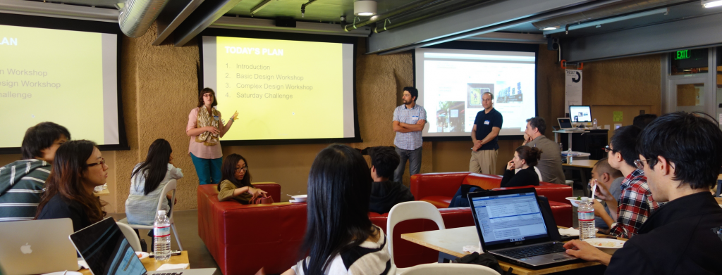
Margaret Hagan, Kursat Ozenc, and Alex Gavis kick off the class Get Smart on legal communication design. (c) Fred Leichter, 2014.

(c) Fred Leichter, 2014.

1. Bringing communication design to law

In May 2014, we ran a Legal Communication Design class at Stanford’s Institute of Design, or the d.school. Though legal communications have a reputation as dense, opaque & heavy, we wanted to open up some space for experimenting with what legal communication could be. The d.school proposes that professionals solve problems through collaborative, interdisciplinary experimentation, all while focused on building solutions that are user-friendly & engaging for specific end-users.

We decided to take this approach and apply it to legal communications. Our goals were twofold:

  1. to train students in how to communicate complex information to lay audiences, and
  2. to scope new patterns and models for more resonant communication design of information that conveys legal terms & conditions, rights and warnings.

We formed a three-person teaching team: Margaret Hagan, a legal designer based at Stanford’s d.school; Alex Gavis, in-house counsel at Fidelity Investments with expertise in consumer and financial regulations and product design; and Kursat Ozenc, an interaction designer trained at Carnegie Mellon’s Design School and working at Autodesk.

Get Smart - poster-for-the-class

We developed a two-day intensive “Pop Up” class at the d.school entitled, “Get Smart: Marking Complicated Information Simple.” We intended for the class to be mostly populated by law students, but most of our applicants came from students studying in other fields: engineering, management science, business, political science, and anthropology. The class was oversubscribed, and ultimately limited to about 45 students.


2. Our approach to complex communication design

The pop-up class was an experiment to see what ideas would emerge from interdisciplinary groups of students using design to make complex legal information more comprehensible. As we prepared for the class, we began to form a Framework of Complex Communication Design. Our central insight is that complex information design can be categorized into two basic branches: (1) that for analysis and understanding, and (2) that for decision-making and action.

Types of Complex Communication Design

Communication Design for Insight and Understanding

The first categorization can be described as making complex sets of information more understandable. There is considerable buzz around this type of complex communication design right now, especially around “data visualizations”. This type of design draws on data sets underlying complex sets of facts, and it attempts to present the data sets in a lively and engaging matter.

In this branch of complex communication design, the goal is to educate. It is to shape data that is otherwise overwhelming into information that is digestible and attractive, and it helps the user understand the data and information. Ideally, the design will allow its author to convey large data sets for better comprehension by individuals — helping them to see patterns, trends, and meaning in an otherwise opaque set of information. The design might also be interactive and flexible enough to allow its end-user to find new insights and inspirations about the data topic, which the design’s author was not aware of.

This type of communication design is commonly employed by scientists, journalists, and others who want to help people make connections between large data sets and the broader world.

Communication Design for Decision-Making

The second stream of communication design is about making complex rules and systems both comprehensible and actionable. It applies to legal communications of notices, rights and warnings. Done well, this type of complex design has the author presenting the rules of a system in their complexity, but empowers the end-user to navigate this complexity — giving them an understanding of the rules and the ability to apply them to the user’s specific situation and decisions.

The goal here is not so much about analysis, like in the first branch, but rather in as helping people make better decisions for themselves. It is about helping people understand the situation that they are in, what rules apply to them, what the consequences of these rules will be, and what kind of behavior to take in response to these rules.

Ideal Legal Communication Design Flow

This type of communication design is a legal design challenge. It is focuses on helping people understand the rules of the world and applying the rules to their own life. It is not education for education’s sake. It is practical, but also quite challenging.

In practice, though legal communication design should apply directly to people’s lives, it does not. The standard for this branch of design is currently low, if we look at the way terms and conditions are presented in consumer contracts, or the legal fine print at the bottom of television advertisements, or the privacy policies on websites. Most often the communications as presented are dense, jargon-laden, and pedantic. They do not provide the user with greater comprehension of the rules, nor do they empower better decision-making.

Our Focus

Accordingly, our goal for the class was to focus on this second category of communication design. We intended to apply user-centered, experimental design process to explore what types of communication could lead to more user engagement, comprehension, and better decision-making.

3. The Class

The d.school class was held over two days: the first day was an evening boot-camp in visual and communication design, followed by a second day “design sprint” to create and test complex legal communication designs in response to specific use-cases we created.

We created the boot-camp to be a staged training. We first taught the basics of good information design. Then, we scaled this knowledge to review complex information design techniques. After this two-staged boot-camp, the next day was an eight-hour session, during which students were challenged to apply what they learned in the first day to legal use-cases.

The Design Bootcamp

Our challenge in the bootcamp was to to cover the basics of quality communication design to a student audience relatively un-versed in design, within a very restricted time. We decided to do a mixture of learning-by-doing and learning-by-exposure. We also created and distributed “cheat-sheets” covering the basic principles of communication design, blended with tips, templates, and suggestions.

We introduced the fundamental Gestalt principles of visual design (i.e., hierarchy, proximity, asymmetry), and then we showed examples of effective and ineffective design.

Kursat Ozenc explains visual design principles through examples.

Kursat Ozenc explains visual design principles through examples. (c) Fred Leichter 2014.

Prior to the class, we had asked students to post examples of complex communication design to our class website. We drew on these student-sourced images for in-class discussion, and our teaching team also scouted images that could demonstrate the fundamental principles. The examples of visual design ranged from those intended to educate, to those meant to delight or intrigue. We mixed in very practical graphics with those with innovative visual cues and illustrations.

Immersing students in many forms of communication design helped to demonstrate design principles in a way that verbal descriptions could not. The examples also provided good inspiration material for the teams to use, when trying to decide how to convey a message, or to synthesize data points into meaningful relationships. Our teaching strategy was to provide the students with a broad portfolio of types of design, so they could see for themselves why certain designs work or do not, and that they could borrow from the designs that engaged them as a user.

We next took the class through a series of short, 20-minute design exercises, to help them build their design muscles for use the next day. First, we asked students to design a flyer invitation to their next birthday – keeping them focused on how to make a convincing communication within space constraints. This was to practice their understanding of basic principles of good composition, messaging, color choice, and imagery.

Next, we ran a more legal design exercise, in which the students had to represent the complex text instructions for using a transit card in a usable way. The goal was to make these terms and conditions into a user-friendly, contextual communication that a user could actually use during their commute to avoid fines.

A quick design to convey a Transit Card's rules to a commuter.

A quick design to convey a Transit Card’s rules to a commuter.

With each of these exercises, students worked by themselves for a short period, and then presented their work to the group. The design reviews provided some critical feedback, as well as encouragement for good design work. These short exercises were warm-ups and team building for the next day’s design sprint.

The Legal Communication Problem and Use Cases

On the second day, the class shifted focus from good communication design practices to the challenges of legal design. Alex began the day with a discussion of why good legal communications design matters. While the law does not require that contracting parties read an agreement, there must be a meeting of the minds. Reasonable processes for obtaining consumer acknowledgement or consent in online agreements are upheld by courts. It takes a lot of bad facts to unwind a contract as unenforceable.

Legal Communication Design - Alex Gavis

Alex Gavis presents the challenges lawyers face when trying to design legal communications to customers. (c) Fred Leichter 2014.

Some laws are proscriptive to protect the public (e.g., the securities laws on full and fair disclosure) others are principles based (e.g., consumer protection laws prohibiting unfair and deceptive acts), and some are structured to validate legitimacy of actions (e.g., the federal and state electronic signature laws).

All this leads to legal dissonance on how consumers may be treated when in transacting online for goods or obtaining services. They generally make purchase decisions not based on any awareness of terms or conditions or the “fine print.” They are confronted with contracts, terms-of-use, consents, and disclosures all over the place, but they typically do not take action on them (click, acknowledge, accept) until after making a decision — usually only upon checkout.

The requirements to make these legitimate in the law can vary by law, regulation, and jurisdiction. Many transactions or interactions wind up in the category of “agree now, worry later” for consumers.

Communications in which the message is well-crafted and the visual is well-rendered can help understanding and mitigate later problems. If there is understanding at the beginning of the consumer-commercial relationship, then there may be less at risk for both parties. Good design and communications may lead to better outcomes as both parties understand what is being asked and required of them and later disputes may be mitigated or dampened.

We assembled four use cases to demonstrate the importance of good communications design.

Use Case 1: “And Where Do I Sign?”

And Where Do I Sign?The first use case mentions a fictitious consumer, Susan, who spends a lot of time researching and connecting with friends about where to put her money. She makes a decision and is eager to open an account quickly at the financial institution she has chosen.

This is where the road gets bumpy for her as she must suddenly navigate disclosures, notices, consents, agreements and the providing of personal information. This mishmash of activity occurs before she can successfully open an account, and she thinks that somewhere in all that language is something that she may wish she had known and understood.

Students were assigned to consider these facts and determine how to design a different experience that would engage and inform (and perhaps delight) Susan.

Use Case #2: “I am on the Run, Just Tell Me What to Do.”

I'm on the Run Just Tell Me What To DoThe second use case involved a similar fact scenario to the first one, but asked students to imagine that Susan is a busy executive who travels all over the U.S. She has a small window of time in which to open an account one day and must do so at the airport between flights.

The students’ assignment was to design a successful (and delightful) experience for Susan that can work with her mobility.


Use Case #3: “When Can I Play?”

When Can I Play?The third use case involved a father–son interaction. Carlos wants to help his young son download an online game. The gaming company has agreements, notices, and terms and conditions that it needs Carlos to agree to before it will allow for the downloading of the game. Some of the conditions are required by law; some are required by the company to protect its intellectual property; and some may be required by the credit card company that is handling the billing.

The students’ assignment was to consider how Carlos, in the process of obtaining information and accepting a free trial, can understand the various rights and responsibilities that he (and his son) will be taking on, including license and intellectual property rights, the conditions and responsibilities for payments and the policies and regulations regarding his and his son’s privacy preferences. They were to design an experience that would allow Carlos to understand better what is involved, and from the standpoint of Carlos completing it online through a mobile device with limited print and storage capabilities.

Use Case #4: “You Want Me to Say What?”

Communication Design use case 4 - you want me to say what?The final use case involved an example of advertising for financial services. Advertising provides a source of information to prospective customers about the products and services offered by financial services firms. Advertisers desire to keep the messaging in advertisements streamlined and straightforward, while at the same time making compelling messaging that will be understood by consumers and complying with regulatory standards.

The students were tasked with conjuring advertising across print, web, mobile and television that can meet the twin goals of being innovative in messaging while adhering to specific regulatory disclosure requirements. The students were provided with examples of the disclosure requirements and were asked to find ways to innovate with the display and positioning of required disclosures. They were challenged to discover new concepts in advertising design to meet the goals of understandability, simplicity and investor understanding.

The Design Sprint

We formed the students into teams, mixing their disciplines to get a balance of law students, engineers, social scientists, and humanities students in each group. Then each group was able to choose which use case they wanted to work on.

With their use case chosen, the teams first worked to flesh out a persona in each case, around which to design and build their models. Next, the teams evaluated the type of information that the use-case required to be presented to the persona-audience. After that, they brainstormed design ideas, about what kinds of communications may engage their persona.

Once they developed ideas, the teams discussed their practicality and, in some cases, the groups voted on which one (or ones) to pursue. With this focus, they then spent an hour designing a prototype of the communication design to test in the field. Some created visuals by hand, others used digital tools to mock-up storyboards, app interfaces, or graphics.

After lunch, they went out onto the Stanford campus to find user testers. They asked members of the public for feedback on their ideas and design. Finally, in the last hour of the workshop, each team presented their final designs and user feedback to the class.

4. Models that Emerged

We found that the students generated ideas that suggest several different models for how to provide notice in a legal situation.

Model 1: Embedded Notice

This model involves embedding information concerning warnings into the context of the content that the user desires to consume.

For a television advertisement, for example, one team proposed that, instead of presenting images and voice together and then the legal disclosures (in “fine print” text) in a separate overlay, the message(s) from the legal disclosures could be woven into the images and the voiceover. This would allow a customer to comprehend the “fine print” information within the visual and aural content experience, without having to strain to read the disclosure text on screen.

For Use Case #3, one team suggested that the privacy disclosures and other legal warnings be incorporated into the game environment. The same avatars, background, points system and interfaces would exist for the game and for the disclosures. They suggested an approach where a game user goes through the disclosures and wins points, advancing in the game universe.

(c) Margaret Hagan 2014

(c) Margaret Hagan 2014

This allows the user to become educated on privacy and legal issues in the context of what he or she wants to do – play the game. It cleverly embeds the disclosures and warnings directly into the game flow.

The overall model has the legal and financial notice woven together with the juicy and non-legal content.

1a: Interactive Games

One popular type of an embedded notice was game-based. Several teams built models around games, putting the information into a highly interactive and rewarding type of situation.

As discussed with the class, a drawback with this model is that it is very intensive, requiring an investment of time from the user as well as from the notice giver. A benefit is that it has a narrative that can be quite engaging. It has stages and incentives to keep exploring the information being communicated.

This model might work very well when the user is already within a digital environment, like a game on a computer or on an app. The notice-game can be woven seamlessly into the experience that the user is trying to enjoy. It should be considered for “entertainment experiences,” when the user is already in an entertainment mode — for example, when he or she is about to play a game, watch a movie, read a magazine, or start a video game.

Model 2: Roadmap with Zoom

This model involves a large map of the notice and message, which the user can then zoom in and out of. The user chooses where to focus, and can see both the complexity all at once from a distance, or zoomed into a particular part of it.

This type of design allows the user to engage with the material selectively and in a staged way. The omniscient user sets the terms.

(c) Margaret Hagan 2014

(c) Margaret Hagan 2014

Two different teams presented designs along this model, but with slight variations. In one model, the designer of the communication sets a sequential path through the communication, and the user goes step by step through it.

The second model is non-sequential and non-linear. The user browses through the communication, zooming in and out of particular topics and choices. The design tracks the progress they have made, but it does not strictly guide the user along a certain path.

Model 3: Divide & Conquer

The divide and conquer model is a modular series of communications that add up to a complete, complex delivery of notice. It involves a modular, staged set of discrete “communication tasks,” that the user proceeds through at their own pace.

The user receives a short communication and then must respond in some way to show that she has registered the information. Each communication is a task, with a two-way channel, of the designer presenting information to the user and the user having to respond in some way. The user goes through the communication tasks one by one, completing the stages and eventually getting the entire communication.

This model takes inspiration from a checklist, but it gives a focused experience for each task. It also lets the user do things in a short way, knowing how much time each of these modules should take and then conquering what they want depending on their situation at the time.

3a: The efficient, clean click-through

One example of this model was more for a professional user, who values efficiency and practicality. The design’s goal was to provide an interactive app that would efficiently let the professional target and flag important information. It was an even more streamlined version of Divide & Conquer, for people who don’t want to dive into any details.

This model allowed for having the details sent later through email or reminders, for when the user may want to refer to the full text. It generally prioritized quick understanding over deep comprehension, but tried to give enough understanding to alert a user to anything she may be concerned about or may want to explore at a later time.

Model 4: Personalized, Conversational, Growing Agreement

In this design, the user responds to prompts, asking him for his information and preferences. As he responds to each prompt, a customized communication is generated for him. It is presented alongside his responses, so he can see how the contract, notice, or other type of legal communication will change depending on his answers.

(c) Margaret Hagan 2014

(c) Margaret Hagan 2014

The legal notice is not a given, but rather is progressively generated by the user. The motive behind this model is to give the user a sense of authorship and control. The user is able to see how his choices affect the length and complexity of provisions of the agreement that he must accept at the end of the process. There is a dynamic nature to this process as paragraphs build or collapse depending upon actions. It is also to show flexibility from the designer and legal communicator — to let them show they are willing to defer to the preferences of the user. The experience becomes one that is constructive.

Model 5: Proximate, Contextual Notification

In the proximate notice design, the legal communication is divided up into stages and then presented to the user as it relates to the topic at hand.

It was designed with the idea of presenting terms and conditions selectively, as it relates to the user’s specific data disclosures. As the user enters data into a field, the design immediately prompts her with what the rules, restrictions and notices are for that piece of information. The user sees the conditions as applied to each data point individually.

The design intends to make the large, complex set of terms and conditions more understandable by contextualizing them, and by presenting them bit by bit. The model ideally helps the user understand concretely how each piece of information she discloses relates to the terms and conditions.

Model 6: Protector Relationship

In the protector model, the design attempts to put the user in the mindset of protecting another person, or a future version of themselves. It may do this through the use of an avatar, who will be affected by the content of the communication. Or it could be through a design that shows the user a future version of herself, and encouraging her to think of the communication as applied to this future version.

The goal is to encourage more engagement with a legal communication by putting the user in the position of protecting someone else. Rather than passing over legal information, the user will invest attention into it because something is at stake for someone else. It taps into a sense of duty to protect, especially for someone who seems vulnerable.

This model of design attempts to facilitate more thoughtfulness about the legal communication — helping the user think about how it will play out over a long term. It may also encourage users to think of cause and effect.

5. Ways Forward

The ideas that emerged were bounded by the limited one-day timing for the class. With more time, we are confident that additional ideas would be born. It was helpful to have a mixture of law, business, engineering, and students in other disciplines participating in the class, as they brought varied ideas to the table.

Now we are planning a follow-up workshop with a more specific group of participants: lawyers who work on legal communication challenges like those in our use cases, and designers who have an interest in engaging, resonant communications. Our plan is to take the models and prototypes that emerged out of the class, and to work with the lawyers and designers to validate or upend these initial drafts. We hope to hone a more definite set of good legal communication design patterns, which can be useful to those making complex information design.

After this next-stage workshop, we are considering a controlled test of several of the most promising concepts to determine whether they have the desired effect of making contracting more understandable and simpler. We could imagine these ideas being tested in any number of different contexts where a business would like its users to agree to specific conditions or agreements. This also could be the subject of psychology research and studies on the propensity for individuals to understand information that is designed for their consumption.

The class confirmed for us that there are design approaches — some of which our class developed and others yet to be found — that can directly address complexity in legal interactions and that may well resonate.


About the Authors

Alex Gavis headshot 150Alex Gavis is a member of the Corporate Legal Department of FMR LLC, the parent company of Fidelity Investments, one of the largest brokerage and mutual fund companies in the United States and the leading provider of workplace retirement savings plans. He manages a team of attorneys and professionals and is responsible for providing legal services to the firm’s retail brokerage, college savings, stock plan and workplace retirement businesses. He also oversees and manages legal services for Fidelity’s businesses involved in electronic and mobile commerce, start-up innovation, and social media. Mr. Gavis also oversees legal advice on all of Fidelity’s national advertising and marketing initiatives. He is frequent speaker and lecturer on securities law and e-commerce issues.

Margaret Hagan headshot 150 x 150Margaret Hagan is a fellow at Stanford Law’s Center on the Legal Profession and a lecturer at Stanford Institute of Design (the d.school). She was a fellow at the d.school from 2013-2014, where she launched the Program for Legal Tech & Design, experimenting in how design can make legal services more usable, useful and engaging. She taught a series of project-based classes, with interdisciplinary student groups tackling legal challenges through user-focused research and design of new legal products and services. She also leads workshops to train legal professionals in the design process, to produce client-focused innovation. Her blog on legal design is Open Law Lab, and her portfolio of design projects and illustrations are available here.

Kursat Ozenc headshot squareKursat Ozenc is a Senior User Experience Designer at Autodesk in San Francisco, building the next generation design tools for infrastructure professionals. He conducts user research, turns research insights into concept designs, & transforms designs into launch-ready systems, interactions, and interfaces. He completed his Ph.D. studies (2011) in design at Carnegie Mellon University. He holds an M.F.A. degree (2004) in Visual Communication Design from Sabanci University in Istanbul, and a bachelors degree (2002) in Industrial Product design from Middle East Technical University, Ankara, Turkiye.
Other posts on visualization and law on this blog include Visual Law: What Lawyers Need to Learn from Information Designers by Helena Haapio and  Stefania Passera.

VoxPopuLII is edited by Judith Pratt. Editors-in-Chief are Stephanie Davidson and Christine Kirchberger, to whom queries should be directed.
 

For decades, words have been lawyers’ tools of trade. Today, we should no longer let tradition force us to think inside the text-only box. Apart from words, there are other means available.

It is no longer enough (if it ever was) to offer more information or to enhance access alone: the real challenge is the understandability of the content. We might have access to information, but still be unable to decode it or realize its importance. It is already painfully clear that the general public does not understand legalese, and that communication is becoming more and more visual and rapid. There is a growing literature about style and typography for legal documents and contracts, yet the use of visual and non-textual elements has been so far omitted for the most part. Perhaps images do not seem “official”, “legal”, or trustworthy enough for all.

Last year, in Sean McGrath’s post on Digital Law, we were alerted to what lawyers need to learn from accountants. In this post, we present another profession as our role model, one with a considerably shorter history than that of accountants: information designers.

Focus on users and good communication

Lawyers are communication professionals, even though we do not tend to think about ourselves in these terms. Most of us give advice and produce content and documents to deliver a specific message. In many cases a document — such as a piece of legislation or a contract — in itself is not the goal; its successful implementation is. Implementation, in turn, means adoption and action, often a change of behavior, on the part of the intended individuals and organizations.

Law school does not teach us how to enhance the effectiveness of our message. While many lawyers are known to be good communicators, most have had to learn the hard way. It is easy to forget that our colleagues, members of the legal community, are not the only users of our work. When it comes to other users of our content and documents, we can benefit from starting to think about 1) who these users are, 2) what they want or need to know, 3) what they want to achieve, 4) in which situation, and 5) how we can make our content and documents as clear, engaging and accessible as possible.

These questions are deeply rooted in the discipline of information design. The work of information designers is about organizing and displaying information in a way that maximizes its clarity and understandability. It focuses on the needs of the users and the context in which they need to find and apply information. When the content is complex, readers need to grasp both the big picture and the details and often switch between these two views. This is where visualization — here understood as adding graphs, icons, tables, charts and images to supplement text — enters the picture. Visualization can help in navigating text, opening up its meaning and reinforcing its message, even in the field of law. And information design is not about visualization only: it is also about many other useful things such as language, readability, typography, layout, color coding, and white space.

Want to see examples? Look no further!

Figure1

Figure 1: Excerpt from Vendor Power! – a visual guide to the rights and duties for street vendors in New York City. © 2009 The Center for Urban Pedagogy.

A convincing example of visualizing legal rules is “Vendor Power!”, a work carried out by a collaboration of the Center for Urban Pedagogy, the designer Candy Chang, and the advocacy organization the Street Vendor Project. After noting that the “rulebook [of legal code] is intimidating and hard to understand by anyone, let alone someone whose first language isn’t English”, the project prepared Vendor Power!, a visual Street Vendor Guide that makes city regulations accessible and understandable (Figure 1). The Guide presents key information using short sentences in five languages along with diagrams illustrating vendors’ rights and the rules that are most commonly violated.

In the UK, the TDL London team turned recent changes in the rules related to obtaining a UK motorcycle licence into an interactive diagram that helps its viewers understand which motorcycles they are entitled to ride and how to go about obtaining a motorcycle licence.  In Canada in 2000, recognizing the need for new ways to improve public access to the law, the Government commissioned a White Paper proposing a new format for legislation. The author, communication designer David Berman, introduced graphic design methods and the concept of using diagrams to help describe laws. While creating a flowchart diagram, Berman’s team revealed inconsistencies not accounted for in the legislation, suggesting that if visualization was used in the drafting process, the resulting legislation could be improved. One of the authors (the designer) can confirm this “logical auditing”  power of visualization, as similar information gaps were promptly revealed by visualizing through flowcharts the Finnish General Terms of Public Procurement in Service Contracts, during the PRO2ACT research project.

Not only have designers applied their talent to legal information; some lawyers, like Susanne Hoogwater of Legal Visuals and Olivia Zarcate of Imagidroit, and future lawyers, like Margaret Hagan of Open Law Lab, have turned into designers themselves, with some remarkable results that you can find on their websites.

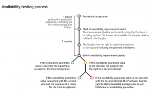
Legal visualization may deal with data, information, or knowledge. While the former two require software tools and coding expertise in order to generate images that represent complex data structures (an example is the work of Oliver Bieh-Zimmert who visualized the network of paragraphs and the structure of the German Civil Code), knowledge visualization tends to use a more ‘handcrafted’ approach, similar to how graphic designers rather than programmers work. The authors of this post have relied on the latter when enhancing contract usability and user experience through visualization, utilizing simple yet effective visualizations such as “metro maps” (Figure 2), timelines, flowcharts, icons and graphs. More examples of the work, carried out in the FIMECC research program User Experience & Usability in Complex Systems (UXUS), are available here, while our most recent paper, Transforming Contracts from Legal Rules to User-centered Communication Tools, published in 2013 Volume I Issue III of Communication Design Quarterly Review , discusses how greatly visualization can contribute to the user-centeredness of contracts.

Figure 2

Figure 2. Example of a “metro map” that explains the process of availability testing, as described in an agreement on the purchase of industrial machinery and equipment. © 2012 Aalto University. Author: Stefania Passera.

When teaching cross-border contract law to business managers and students, one of the authors (the lawyer) has also experimented with graphic facilitation and real-time visualization, with the aim of curing contract phobia, changing attitudes, and making contracts’ invisible (implied) terms visible. Examples of images by Annika Varjonen of Visual Impact are available here and, dating back from 1997, here.

The Wolfram Demonstrations Project illustrates a library of visual and interactive demonstrations, including one contributed by Seth Chandler on the Battle of Forms that describes the not-uncommon situation where one company makes an offer using a pre-printed form containing its standard terms, and the other party responds with its own form and set of standard terms. The demonstration allows users to choose various details of the case, with the output showing the most likely finding as to whether a contract exists and the terms of that contract, together with the arguments that can be advanced in support of that finding.

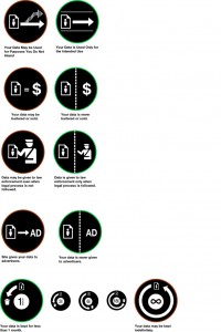
In the digital world, Creative Commons licenses use simple, recognizable icons which can be clicked on to reveal a plain-language version of the relevant text. If additional information is required, the full text is also available and just one click away. The information is layered: there is what the authors call the traditional Legal Code (the “lawyer readable” version), the Commons Deed (the “human readable” version, acting as a user-friendly interface to the Legal Code), and the “machine readable” version of the license. A compilation made by Pär Lannerö in the context of the Common Terms project reveals a number of projects that have looked into the simplification of online terms, conditions and policies. An experiment involving icons was carried out by Aza Raskin for Mozilla. The set of Privacy Icons developed by Raskin can be used by websites to clarify the ways in which users of the website are agreeing to allow their personal data to be used (Figure 3).

Figure 3

Figure 3. Examples of icons used for the rapid communication of complex content on the Web: Mozilla Privacy Icons by Aza Raskin. Source: flickr.com. Image released under a CreativeCommons licence CC BY-NC 2.0

In Australia, Michael Curtotti and Eric McCreath have worked with enhancing the online visualization of legislation, and work is currently in progress on the development of software-based tools for reading and writing law . This work has grown out of experience in contract drafting and the drafters’ needs for practical software tools. Already in 2001, in their ACCA Docket article Doing deals with flowcharts, Henry W. (Hank) Jones and Michael Oswald recognized this need and discussed the technology tools available to help lawyers and others to use flowcharts to clarify contractual information. They showed examples of how the logic of contract structure, the actors involved, and clauses such as contract duration and indemnification can be visualized, as well as explaining why this should be done.

In the United States, the State Decoded (State codes, for humans) is a platform that develops new ways to display state codes, court decisions, and information from legislative tracking services. With typography, embedded definitions of legal terms and other means, this project aims to make the law more easily understandable. The first two state sites, Virginia and Florida, are currently being tested.

Recently, visual elements have even made their way into court decisions: In Sweden, a 2009 judgment of the Court of Appeal for Western Sweden includes two timeline images showing the chain of events that is crucial to understanding the facts of the case. This judgment won the Plain Swedish Crystal 2010, a plain language award. In the United States, an Opinion by Judge Richard Posner of the Chicago-based 7th U.S. Circuit Court of Appeals uses the ostrich metaphor to criticize lawyers who ignore court precedent. Two photos are included in this opinion: one of an ostrich with its head buried in the sand, another of a man in a suit with his head buried in the sand.

Want to learn more and explore? Read this – or join one of our Design Jams!

In Central Europe, the visualization of legal information has developed into a research field in its own right. In German-speaking countries, the terms legal visualization (Rechtsvisualisierung), visual legal communication, visual law and multisensory law have been used to describe this growing field of research and practice. The pioneer, Colette R. Brunschwig, defended her doctoral thesis on the topic  in 2001, and has since published widely on related topics. She is the leader of the Multisensory Law & Visual Law Community at beck-community.

In his doctoral research related to legal risks in the context of contracts at the Faculty of Law in the University of Oslo, Tobias Mahler used icons and diagrams illustrating legal risk and developed a graphical modeling language. In a case study he conducted, a group of lawyers, managers, and engineers were asked to use the method to analyze the risks connected with a contract proposal. The results showed that the diagrams were perceived as very helpful in communicating risk.

At the Nordic Conference of Law and IT, “Internationalisation of law in the digital information society” in Stockholm in November 2012, visualization of law was one of the three main topics. The proceedings, which include visual law related papers by Colette R. Brunschwig, Tobias Mahler and Helena Haapio, will be published in the forthcoming Nordic Yearbook of Legal Informatics (Svantesson & Greenstein, eds., Ex Tuto Publishing 2013).

Furthermore, the use of visualizations has been studied, for example, in the context of improving comprehension of jury instructions and in facilitating the making of complex decisions connected with dispute resolution. Visualization has also been observed in the role of a persuasion tool in a variety of settings, from the courtroom to the boardroom. After Richard Sherwin debuted Visual Persuasion in the Law at New York Law School and launched the Visual Persuasion Project website , it has become easier for law schools to teach their students about visual evidence and visual advocacy. It is no longer unusual for law teachers or students to use flowcharts and decision trees, and the list goes on. A Google search will reveal the growing number of such applications in law.

If instead of reading you prefer learning by doing, there are some great opportunities later this year. The Simplification Centre and the University of the Aegean will run an international summer/autumn Course on Information Design 30 September to 4 October 2013 in Syros, Greece. Provided that there is enough interest, we plan to arrange 1) special sessions on merging contract/legal design with information design and visualization; and 2) a Legal Design Jam, modeled on hackathons, with a small committed group of interested people, including legal and other practitioners and graphic designers, aiming at giving an extreme visual makeover to a chosen text or document (piece of legislation, contract, license, terms and conditions, …). If you are interested, please contact the organizers at info(at)simplificationcentre.org.uk.

On 8 October 2013, the International Association for Contract & Commercial Management (IACCM) will hold its Academic Forum in Phoenix, Arizona. The conference topics include legal visualization as it relates to commercial and contract management. If you are interested in submitting a proposal for a presentation or a paper, there is still time to do so: the deadline is 1 July 2013. Please see the Call for Papers for details. If we can find a host and a group of committed professionals, scholars and graphic designers, we are also planning to put together a Design Jam right before or after the IACCM Americas Forum on a US location to be agreed. The candidate document for redesign is still to be decided, so please send us your suggestions! If you are interested to host or to participate, please contact either of us at the email address below to express interest, ask questions, or give suggestions.

What does the future hold?

We see these steps as just the beginning. Once the visual turn has begun, we do not think it can be stopped; the benefits are just too many. As lawyers, we have a lot to learn and we could do our job better in so many respects if we indeed started to get into the mode of thinking and acting like a designer and not just like a lawyer. This applies not only to purely legal information, but everything else we produce: contracts, memos, corporate governance materials, policies, manuals, employee handbooks, and guidance.

Legal information tends to be complex, and information design(ers) can help us make it easier to understand and act upon. The goal is accomplishing the writer’s goals by meeting the readers’ needs. We can start to radically transform legal information following the footsteps of Rob Waller’s team at the Simplification Centre by applying What makes a good document to legal documents.

With new tools and services being developed, it will become easier to convey our content and documents in more usable and more engaging ways. As the work progresses and new tools and apps appear, we are likely to see a major change in the legal industry. Meanwhile, let us know your views and ideas and what you are doing or interested in doing with visuals.

Helena HaapioHelena Haapio is International Contract Counsel for Lexpert Ltd based in Helsinki, Finland. Before founding Lexpert she served for several years as in-house legal counsel. She holds a Diploma in Legal Studies (University of Cambridge) and a LL.M. (Turku). She does research on proactive contracting, user-centered contract design and visualization as means to enhance companies’ ease of doing business and to simplify contracting processes and documents as part of her Ph.D. at the University of Vaasa, where she teaches strategic business law. She also acts as arbitrator. Her recent books include A Short Guide to Contract Risk (Gower 2013) and Proactive Law for Managers (Gower 2011), co-authored with Professor George Siedel. Through visualization, she seeks to revolutionize the way contracts and the law are communicated, taught, and perceived. Helena can be contacted at Helena.Haapio(at)lexpert.com.

Stefania Passera Soita mummolle!Stefania Passera is a researcher in MIND Research Group, a multidisciplinary research team at Aalto University School of Science, Helsinki, Finland. She holds a MA in graphic design (Aalto University School of Art, Design and Architecture), and has been doing research on the usability and user experience of information visualizations in contracts as part of her Ph.D. The leitmotiv of her work is to explore how design and designers can contribute to new multidisciplinary endeavors and what value their way of thinking and doing bring to the mix. Stefania has been collaborating with private and public organizations in Finland on the development of user-centered visual contract documents since 2011.
Stefania can be contacted at stefania.passera(at)aalto.fi


VoxPopuLII is edited by Judith Pratt. Editors-in-Chief are Stephanie Davidson and Christine Kirchberger, to whom queries should be directed.

The growing usage of apps meant it was only a matter of time until they would find their way into legal education. Following up on a previously published article on LaaS – Law as a Service, this post discusses different ways that apps can be included into the law degree curriculum.

1 Changing legal education through the use of apps

There are different ways in which apps can be used in legal education in order to better prepare students for the legal profession. In this post we suggest three different possibilities for the usage of apps, reflecting different pedagogical styles and learning outcomes. What each of the suggestions has in common is to bring legal education closer to the real-life work of lawyers.

Through identifying aspects in which we perceive legal education as lacking quality or quantity, we apply and implement these to our suggestions for changed legal education. The aspects we view as lacking are: identifying and managing risks, the interaction between different areas of law, and proactive problem-based learning. To take each of these briefly in turn:

  • managing risks is something that practicing lawyers and other legal service professionals must do on a daily basis. Law is not only about applying legal rules but also about weighing options, estimating possible outcomes and deciding upon which risks to accept. Legal education has not traditionally included this in the curriculum, and students have arguably very little experience of such training in their studies.
  • interaction between different areas of law is often hard to incorporate in legal studies, which follow a block or module structure. Each course provides students with in-depth knowledge of that particular legal area. However, the interaction between such modules is lacking, with teachers often unaware of the content of preceding or succeeding courses. For students, a problem with this module structure can be that they forget the content of a course studied at an earlier stage in their education.
  • problem-based learning is generally encouraged and applied in legal education. However, most problem-based learning (PBL) is reactive, asking students to evaluate the legal consequences of a scenario that has already played out, instead of training students purely in after-the-fact solutions, in other words “clearing up the legal mess.” PBL should be made more proactive, aiming to train students in identifying and counteracting problems before they arise. This can also be viewed as an implementation of the first aspect, managing risks.

In aiming to include these aspects in legal education, we view technology as playing an important role. Perhaps ideally, the whole legal education could be re-structured in order to include such practical aspects that reflect the current legal profession; however, such change is perhaps too complex and viewed as somewhat unnecessary by those who are able to make such changes – if it ain’t broke, don’t fix it, as the saying goes. An app is not necessarily the sole possible implementation method, but it serves as an example of how these aspects can relatively easily be brought within legal education.

The first teaching approach looks at legal aspects of apps themselves, where the apps are viewed as objects within law. Here students are provided with a set problem and are encouraged to consider how different areas of law may apply to the app in question, and how the various areas impact on each other. This approach implements both PBL and the interaction of different legal fields. Proactiveness may also be included by asking students to identify legal risks of the app, and how such risks could by reduced through the use of law.

The second approach brings together technology and law, and is as such a suitable suggestion for inclusion in a legal informatics course, or as part of more general jurisprudence. Students are given the task of developing a legal service app, and thus must implement law through a technological tool. Students must first identify a need for a service within an area of law of their choosing, and then develop an app which provides the service. This approach implements both PBL and proactiveness, and can also require students to consider both legal and technical risks.

The third approach aims to add value to the legal education as a whole, by making available an app to students to be used alongside teaching, complementing the existing education. Students are provided with the opportunity to test their knowledge, and combine different areas of study through interactive learning. Depending on the design of the app, this approach has the possibility of implementing all aspects: PBL, interaction of legal fields, and proactiveness or risk management.

2 Legal aspects of apps

Legal education in many countries around the world is set up as linear blocks of different legal fields and subject areas. As law is often divided into various sub-fields–such as private law, public law, administrative law, environmental law, or information technology law–it appears only natural to discuss and teach the subjects one by one. The amount of material to be learned by the student would otherwise be overwhelming. While in some countries, exams might encompass multiple fields of law, subjects are being taught in a consecutive order.

Though the pedagogical reasons for the linearity in legal education are convincing, some improvements are still possible. One idea that we would like to discuss here are legal aspects of apps that intertwine different legal fields and challenge the students to analyze one particular phenomena from various different legal angles. We are not suggesting any particular fora for this exercise; these might stretch from traditional in-class seminars to online e-learning platforms to a mixture of the two and be included in law school curricula either as compulsory or selective modules.

Apps and information communication technologies, in general, do not adhere to geographical, physical or time related boundaries. They inherently challenge the traditional legal system based on bricks and mortar. In this regard they are, therefore, well-suited for legal analysis.

Another reason to use apps as the object for analysis by students is their popularity among the younger (and older) generation and therefore the close relationship students have to them to start with. As an example, one can compare it to using Facebook when discussing privacy, as opposed to showing a large company’s employee database.

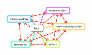
In order to reflect the real-life experience of the exercise even more, the students would be allocated a certain expert area. As at law firms, one student would be an expert in intellectual property rights, another in contract law, another in privacy, international law, consumer rights issues, etc.

The students would –from the perspective of their expert area–firstly investigate possible legal issues with a specific gaming app, for example. They would analyze the application of the rules and norms within their field and identify potential conflicts or loopholes within these rules. Their investigation would include testing the app itself, as well as looking at possible end-user agreements and other applicable contractual agreements between the user, the app store and the developer of the app.

The next step would be to identify and discuss possible overlaps, discrepancies and conflicts between the different areas of law in relation to the app. The exercise should result in a written and/or oral report of the different legal issues involved and solutions to potential conflicts between the law and the app.

Adding another layer of real-life scenario, each group could be asked to present their findings to an imaginative client who is the producer of the app. This simulation would allow the students not only to develop a legal analysis based on correlating fields of law but also to present the analysis to non-lawyers, translating legal jargon into understandable everyday language.

The exercise–analyzing an existing app–very much fits into the idea often conveyed in legal education that law is applied after an incident occurs. In order to add a level of proactivity, students could be asked to analyze an app under production, before it is launched. This would guarantee more proactive thinking by the students asking them to foresee potential conflicts and avoid them, rather than discussing legal issues after they have arisen.

While the exercise as such might not be a revolutionary idea, we think that the increased inclusion of such exercises in legal education would contribute to better preparation of students for their life as young lawyers.

3 Law’s implementation in apps

While the previous exercise fits well within the traditional legal education by asking students to deliver a legal analysis, a topic less discussed in undergraduate legal studies is how to employ technology for delivering law. With a few exceptions, students generally focus on analyzing the law rather than implementing law in technology.Change Priorities

Until several years ago legal analysis was the main business for lawyers, so legal education well reflected the profession. In the last few years, however, legal services delivered via and as technology have increased and opened up a new market for lawyers and legal professionals. This change should be reflected in legal education in order to prepare students for their future.

While the idea is not to replace lawyers with apps or software, an app or another technology could either help lawyers in their working tasks or deliver law as a valuable service for consumers, citizens, companies or organizations. Examples of such apps, both for lawyers and end-users, are mentioned in a post at iinek’s blog and Slaw; shorter lists can be found on iinek’s Delicious page and the iPad4lawyers blog.

In the exercise, students would look at law from a different perspective, i.e. how legal regulations affect the individual or organization. Going away from a linear text approach, students would have to translate law into a format that users or apps can read. In other words, law would have to suit the user/app, and not the other way around. Students would, therefore, have to go beyond text and translate rules into flowcharts, diagrams, mind maps and other visual tools in order for the app to be able to follow the law’s instructions.

Implementing legal rules into technology, therefore, not only encourages students to think proactively but it also motivates them to identify solutions for the application of the law and how rules could be transformed into practice. From a pedagogical point of view the exercise would allow the students to think about different aspects of law beyond the traditional case or contract. It would also encourage a wider viewpoint of law as a tool in society.

Again, how the exercise is included in the curriculum is a matter of taste. Technical assistance is of importance, in order for students to know what aspects to take into account and what schematics developers need in order to be able to create an app. The exercise could be set up as a competition (Georgetown Law SchoolIron Tech Lawyer) with an expert jury consisting of practicing lawyers and developers.

4 Legal education as an app

Talking about legal education as an app can have different meanings. While legal apps (for lawyers and individuals) and educational apps are rather common these days, legal educational apps are not so developed, yet.Puzzle

Legal education, as mentioned, is traditionally taught in blocks or modules, with very few references and links between them. This setup clearly has its benefits, not least logistically. There are clear arguments in favor of such an approach; planning and studying becomes easier for teachers and students alike, time limitations mean that implementing an approach that makes connections between each subject is hard. This is where we believe that technology has the potential to play an important role. Technology is not bound to physical classrooms and attendance requirements of students or teachers. It has the ability to be accessed at a time of the student’s choosing, without placing additional demands on instructors.

A legal education app could provide the key in aiding students to make connections between their study areas; it could be made to fit alongside a law degree, assuming a student’s knowledge in sync with their level of study, by including content from both current and past courses. The app would offer an easy way to implement an interactive, problem-based learning approach. It could provide additional content, quizzes, exercises, social media functions etc. complementing the education and enabling a holistic perspective.

Although no teacher-student relationship is required here, clearly pedagogical thinking would need to play a strong role so that a worthwhile learning environment for the individual could be created. Much time and effort would need to be invested in planning, and the application itself would need to be flexible to adjust to different study plans and so forth. Another issue is, of course, who would make the app. As curricula vary from law school to law school, and jurisdiction to jurisdiction, such an app is ideally built by those who know the curriculum. Such “in-house” expertise also means that potential bias from outside factors should be avoided.

Legal apps have already been introduced to help lawyers study for qualifying exams, e.g. BarMax. (These are often, however, still very topic-specific.) Implementing the same kind of thinking at the educational level would start to prepare students for their future workplace, allowing them to be better prepared for helping clients with real-world scenarios dealing with complex and interrelating legal issues. If students begin such thinking at the beginning of their legal studies, it becomes normal, arguably allowing for better educated graduates.

This last approach is perhaps a little future-oriented (although not as much as, for example, grading by technology), and it is of course not easy to implement at the university level; academics must work together with app developers to produce a tool of real value to students. However, even a slimmed-down version of such an app can be a tool for helping students prepare for exams, test their knowledge of legal areas, or simply make sure that they have understood concepts covered in teaching. Some examples of such implementations in legal education are shown here.

5 Conclusions

There is no doubt that apps are the future for legal services. To what extent they will be included in legal education is yet to be decided. Here we have shown three differing approaches that could help in this regard. Implementation of any or all of these would bring in aspects that are currently lacking in legal education.

Rather often discussions on technology and legal education focus on e-learning and online teaching environments. In our opinion, traditional offline exercises and their pedagogical value should not be underestimated, with technology offering an excellent platform as an object, tool or companion during legal education and life as a lawyer.

6 Sources

Christine KirchbergerChristine Kirchberger is a doctoral candidate & lecturer in legal informatics at the Swedish Law and Informatics Research Institute (IRI). Her research focuses on legal information retrieval, the concept of legal information within the framework of the doctrine of legal sources and also examines the information-seeking behaviour of lawyers. Christine blogs at iinek.wordpress.com and can be found as @iinek on Twitter.

Pam StorrPam Storr is a lecturer at the Swedish Law and Informatics Research Institute (IRI), and course director for the Master Programme in Law and Information Technology at Stockholm University. Her main areas of interest are within information technology and intellectual property law. Pam is the editor for IRI’s blog, Blawblaw, and can be found as @pamstorr on Twitter.


VoxPopuLII is edited by Judith Pratt. Editors-in-Chief are Stephanie Davidson and Christine Kirchberger, to whom queries should be directed. The information above should not be considered legal advice. If you require legal representation, please consult a lawyer.

THE JUDICIAL CONTEXT: WHY INNOVATE?

The progressive deployment of information and communication technologies (ICT) in the courtroom (audio and video recording, document scanning, courtroom management systems), jointly with the requirement for paperless judicial folders pushed by e-justice plans (Council of the European Union, 2009), are quickly transforming the traditional judicial folder into an integrated multimedia folder, where documents, audio recordings and video recordings can be accessed, usually via a Web-based platform. This trend is leading to a continuous increase in the number and the volume of case-related digital judicial libraries, where the full content of each single hearing is available for online consultation. A typical trial folder contains: audio hearing recordings, audio/video hearing recordings, transcriptions of hearing recordings, hearing reports, and attached documents (scanned text documents, photos, evidences, etc.). The ICT container is typically a dedicated judicial content management system (court management system), usually physically separated and independent from the case management system used in the investigative phase, but interacting with it.

Most of the present ICT deployment has been focused on the deployment of case management systems and ICT equipment in the courtrooms, with content management systems at different organisational levels (court or district). ICT deployment in the judiciary has reached different levels in the various EU countries, but the trend toward full e-justice is clearly in progress. Accessibility of the judicial information, both of case registries (more widely deployed), and of case e-folders, has been strongly enhanced by state-of-the-art ICT technologies. Usability of the electronic judicial folders is still affected by a traditional support toolset, such that an information search is limited to text search, transcription of audio recordings (indispensable for text search) is still a slow and fully manual process, template filling is a manual activity, etc. Part of the information available in the trial folder is not yet directly usable, but requires a time-consuming manual search. Information embedded in audio and video recordings, describing not only what was said in the courtroom, but also the specific trial context and the way in which it was said, still needs to be exploited. While the information is there, information extraction and semantically empowered judicial information retrieval still wait for proper exploitation tools. The growing amount of digital judicial information calls for the development of novel knowledge management techniques and their integration into case and court management systems. In this challenging context a novel case and court management system has been recently proposed.

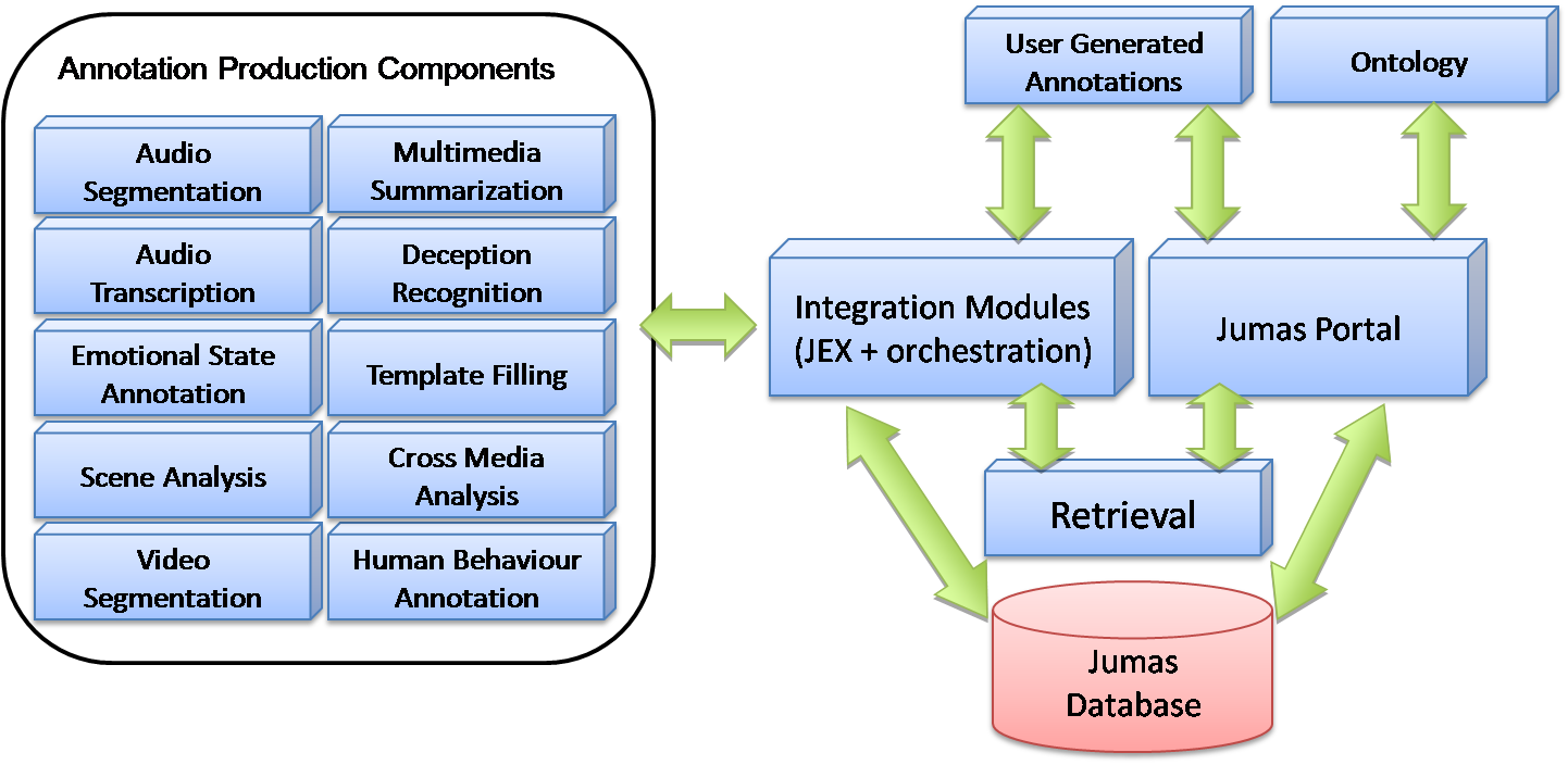
The JUMAS project (JUdicial MAnagement by digital libraries Semantics) was started in February 2008, with the support of the Polish and Italian Ministries of Justice. JUMAS seeks to realize better usability of multimedia judicial folders — including transcriptions, information extraction, and semantic search –to provide to users a powerful toolset able to fully address the knowledge embedded in the multimedia judicial folder.

The JUMAS project has several objectives:

  • (1) direct searching of audio and video sources without a verbatim transcription of the proceedings;
  • (2) exploitation of the hidden semantics in audiovisual digital libraries in order to facilitate search and retrieval, intelligent processing, and effective presentation of multimedia information;
  • (3) fusing information from multimodal sources in order to improve accuracy during the automatic transcription and the annotation phases;
  • (4) optimizing the document workflow to allow the analysis of (un)structured information for document search and evidence-based assessment; and
  • (5) supporting a large scale, scalable, and interoperable audio/video retrieval system.

JUMAS is currently under validation in the Court of Wroclaw (Poland) and in the Court of Naples (Italy).

THE DIMENSIONS OF THE PROBLEM

In order to explain the relevance of the JUMAS objectives, we report some volume data related to the judicial domain context. Consider, for instance, the Italian context, where there are 167 courts, grouped in 29 districts, with about 1400 courtrooms. In a law court of medium size (10 courtrooms), during a single legal year, about 150 hearings per court are held, with an average duration of 4 hours. Considering that in approximately 40% of them only audio is recorded, in 20% both audio and video, while the remaining 40% has no recording, the multimedia recording volume we are talking about is 2400 hours of audio and 1200 hours of audio/video per year. The dimensioning related to the audio and audio/video documentation starts from the hypothesis that multimedia sources must be acquired at high quality in order to obtain good results in audio transcription and video annotation, which will affect the performance connected to the retrieval functionalities. Following these requirements, one can figure out a storage space of about 8.7 megabytes per minute (MB/min) for audio and 39 MB/min for audio/video. This means that during a legal year for a court of medium size we need to allocate 4 terabytes (TB) for audio/video material. Under these hypotheses, the overall size generated by all the courts in the justice system — for Italy only — in one year is about 800 TB. This shows how the justice sector is a major contributor to the data deluge (The Economist, 2010).
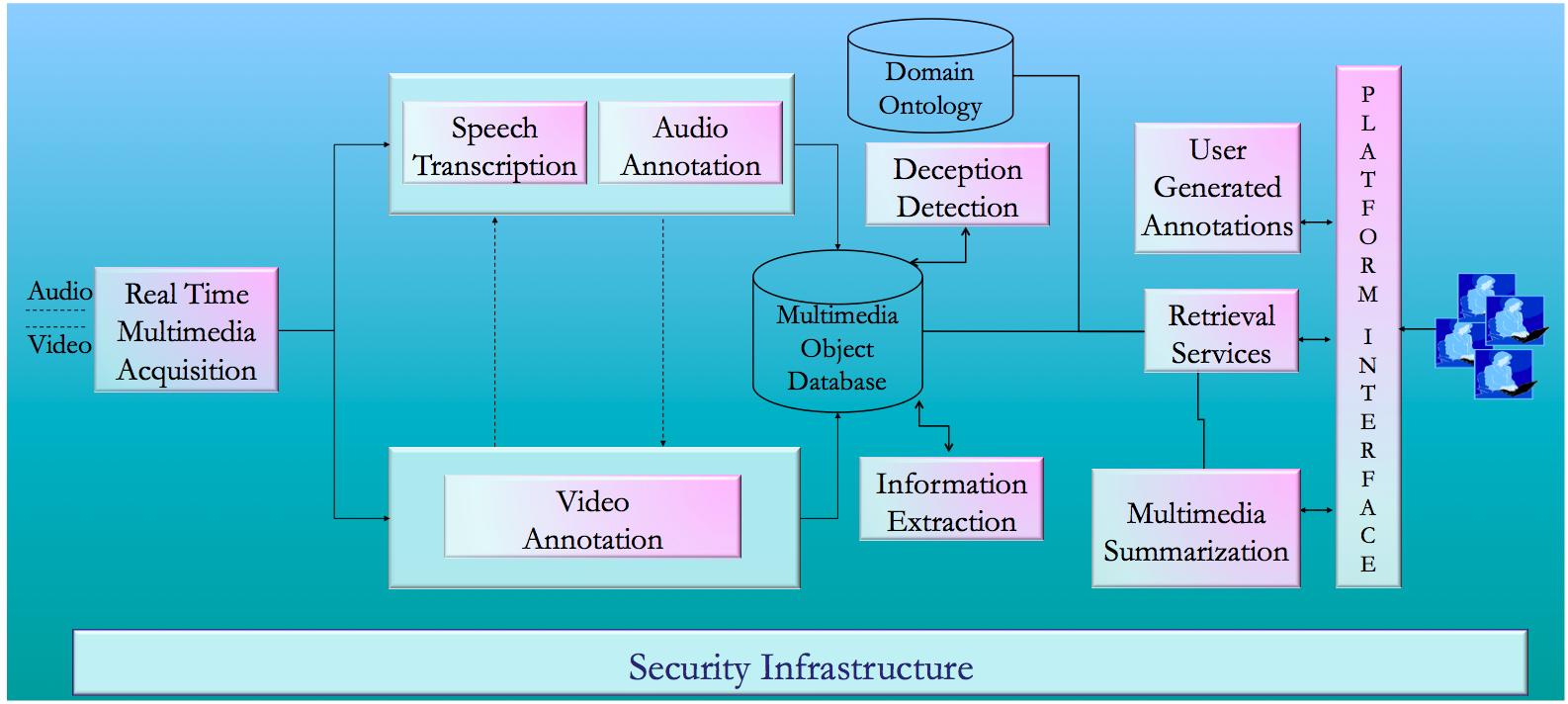
In order to manage such quantities of complex data, JUMAS aims to:

  • Optimize the workflow of information through search, consultation, and archiving procedures;
  • Introduce a higher degree of knowledge through the aggregation of different heterogeneous sources;
  • Speed up and improve decision processes by enabling discovery and exploitation of knowledge embedded in multimedia documents, in order to consequently reduce unnecessary costs;
  • Model audio-video proceedings in order to compare different instances; and
  • Allow traceability of proceedings during their evolution.

THE JUMAS SYSTEM

To achieve the above-mentioned goals, the JUMAS project has delivered the JUMAS system, whose main functionalities (depicted in Figure 1) are: automatic speech transcription, emotion recognition, human behaviour annotation, scene analysis, multimedia summarization, template-filling, and deception recognition.


Figure 1: Overview of the JUMAS functionalities

The architecture of JUMAS, depicted in Figure 2, is based on a set of key components: a central database, a user interface on a Web portal, a set of media analysis modules, and an orchestration module that allows the coordination of all system functionalities.

Figure 2: Overview of the JUMAS architecture

The media stream recorded in the courtroom includes both audio and video that are analyzed to extract semantic information used to populate the multimedia object database. The outputs of these processes are annotations: i.e., tags attached to media streams and stored in the database (Oracle 11g). The integration among modules is performed through a workflow engine and a module called JEX (JUMAS EXchange library). While the workflow engine is a service application that manages all the modules for audio and video analysis, JEX provides a set of services to upload and retrieve annotations to and from the JUMAS database.

JUMAS: THE ICT COMPONENTS

KNOWLEDGE EXTRACTION

Automatic Speech Transcription. For courtroom users, the primary sources of information are audio-recordings of hearings/proceedings. In light of this, JUMAS provides an Automatic Speech Recognition (ASR) system (Falavigna et al., 2009 and Rybach et al., 2009) trained on real judicial data coming from courtrooms. Currently two ASR systems have been developed: the first provided by Fondazione Bruno Kessler for the Italian language, and the second delivered by RWTH Aachen University for the Polish language. Currently, the ASR modules in the JUMAS system offer 61% accuracy over the generated automatic transcriptions, and represent the first contribution for populating the digital libraries with judicial trial information. In fact, the resulting transcriptions are the main information resource that are to be enriched by other modules, and then can be consulted by end users through the information retrieval system.

Emotion Recognition. Emotional states represent an aspect of knowledge embedded into courtroom media streams that may be used to enrich the content available in multimedia digital libraries. Enabling the end user to consult transcriptions by considering the associated semantics as well, represents an important achievement, one that allows the end user to retrieve an enriched written sentence instead of a “flat” one. Even if there is an open ethical discussion about the usability of this kind of information, this achievement radically changes the consultation process: sentences can assume different meanings according to the affective state of the speaker. To this purpose an emotion recognition module (Archetti et al., 2008), developed by the Consorzio Milano Ricerche jointly with the University of Milano-Bicocca, is part of the JUMAS system. A set of real-world human emotions obtained from courtroom audio recordings has been gathered for training the underlying supervised learning model.

Human Behavior Annotation. A further fundamental information resource is related to the video stream. In addition to emotional states identification, the recognition of relevant events that characterize judicial proceedings can be valuable for end users. Relevant events occurring during proceedings trigger meaningful gestures, which emphasize and anchor the words of witnesses, and highlight that a relevant concept has been explained. For this reason, the human behavior recognition modules (Briassouli et al., 2009, Kovacs et al., 2009), developed by CERTH-ITI and by MTA SZTAKI Research Institute, have been included in the JUMAS system. The video analysis captures relevant events that occur during the course of a trial in order to create semantic annotations that can be retrieved by judicial end users. The annotations are mainly concerned with the events related to the witness: change of posture, change of witness, hand gestures, gestures indicating conflict or disagreement.
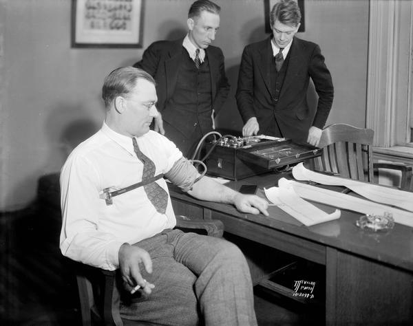
Deception Detection. Discriminating between truthful and deceptive assertions is one of the most important activities performed by judges, lawyers, and prosecutors. In order to support these individuals’ reasoning activities, respecting corroborating/contradicting declarations (in the case of lawyers and prosecutors) and judging the accused (judges), a deception recognition module has been developed as a support tool. The deception detection module developed by the Heidelberg Institute for Theoretical Studies is based on the automatic classification of sentences performed by the ASR systems (Ganter and Strube, 2009). In particular, in order to train the deception detection module, a manual annotation of the output of the ASR module — with the help of the minutes of the transcribed sessions — has been performed. The knowledge extracted for training the classification module deals with lies, contradictory statements, quotations, and expressions of vagueness.
Information Extraction. The current amount of unstructured textual data available in the judicial domain, especially related to transcriptions of proceedings, highlights the necessity of automatically extracting structured data from unstructured material, to facilitate efficient consultation processes. In order to address the problem of structuring data coming from the automatic speech transcription system, Consorzio Milano Ricerche has defined an environment that combines regular expressions, probabilistic models, and background information available in each court database system. Thanks to this functionality, the judicial actors can view each individual hearing as a structured summary, where the main information extracted consists of the names of the judge, lawyers, defendant, victim, and witnesses; the names of the subjects cited during a deposition; the date cited during a deposition; and data about the verdict.
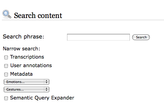
KNOWLEDGE MANAGEMENT

Information Retrieval. Currently, to retrieve audio/video materials acquired during a trial, the end user must manually consult all of the multimedia tracks. The identification of a particular position or segment of a multimedia stream, for purposes of looking at and/or listening to specific declarations, is possible either by remembering the time stamp when the events occurred, or by watching or hearing the whole recording. The amalgamation of automatic transcriptions, semantic annotations, and ontology representations allows us to build a flexible retrieval environment, based not only on simple textual queries, but also on broad and complex concepts. In order to define an integrated platform for cross-modal access to audio and video recordings and their automatic transcriptions, a retrieval module able to perform semantic multimedia indexing and retrieval has been developed by the Information Retrieval group at MTA SZTAKI. (Darczy et al., 2009)
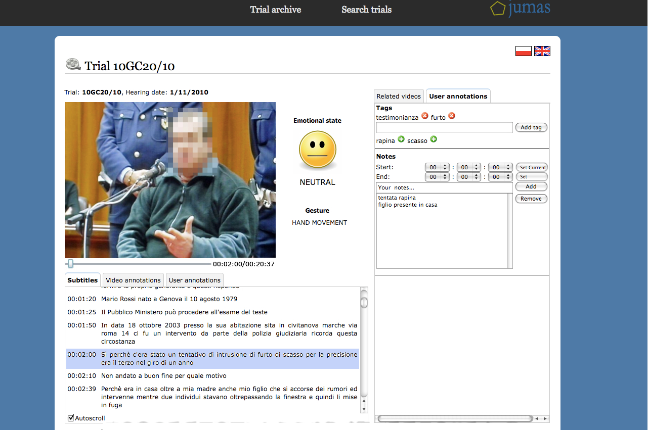
Ontology as Support to Information Retrieval. An ontology is a formal representation of the knowledge that characterizes a given domain, through a set of concepts and a set of relationships that obtain among them. In the judicial domain, an ontology represents a key element that supports the retrieval process performed by end users. Text-based retrieval functionalities are not sufficient for finding and consulting transcriptions (and other documents) related to a given trial. A first contribution of the ontology component developed by the University of Milano-Bicocca (CSAI Research Center) for the JUMAS system provides query expansion functionality. Query expansion aims at extending the original query specified by end users with additional related terms. The whole set of keywords is then automatically submitted to the retrieval engine. The main objective is to narrow the search focus or to increase recall.

User Generated Semantic Annotations. Judicial users usually manually tag some documents for purposes of highlighting (and then remembering) significant portions of the proceedings. An important functionality, developed by the European Media Laboratory and offered by the JUMAS system, relates to the possibility of digitally annotating relevant arguments discussed during a proceeding. In this context, the user-generated annotations may aid judicial users in future retrieval and reasoning processes. The user-generated annotations module included in the JUMAS system allows end users to assign free tags to multimedia content in order to organize the trials according to their personal preferences. It also enables judges, prosecutors, lawyers, and court clerks to work collaboratively on a trial; e.g., a prosecutor who is taking over a trial can build on the notes of his or her predecessor.

KNOWLEDGE VISUALIZATION

Hyper Proceeding Views. The user interface of JUMAS — developed by ESA Projekt and Consorzio Milano Ricerche — is a Web portal, in which the contents of the database are presented in different views. The basic view allows browsing of the trial archive, as in a typical court management system, to view general information (dates of hearings, name of people involved) and documents attached to each trial. JUMAS’s distinguishing features include the automatic creation of a summary of the trial, the presentation of user-generated annotations, and the Hyper Proceeding View: i.e., an advanced presentation of media contents and annotations that allows the user to perform queries on contents, and jump directly to relevant parts of media files.


Multimedia Summarization. Digital videos represent a fundamental information resource about the events that occur during a trial: such videos can be stored, organized, and retrieved in a short time and at low cost. However, considering the dimensions that a video resource can assume during the recording of a trial, judicial actors have specified several requirements for digital trial videos: fast navigation of the stream, efficient access to data within the stream, and effective representation of relevant contents. One possible solution to these requirements lies in multimedia summarization, which derives a synthetic representation of audio/video contents with a minimal loss of meaningful information. In order to address the problem of defining a short and meaningful representation of a proceeding, a multimedia summarization environment based on an unsupervised learning approach has been developed (Fersini et al., 2010) by Consorzio Milano Ricerche jointly with University of Milano-Bicocca.

CONCLUSION

The JUMAS project demonstrates the feasibility of enriching a court management system with an advanced toolset for extracting and using the knowledge embedded in a multimedia judicial folder. Automatic transcription, template filling, and semantic enrichment help judicial actors not only to save time, but also to enhance the quality of their judicial decisions and performance. These improvements are mainly due to the ability to search not only text, but also events that occur in the courtroom. The initial results of the JUMAS project indicate that automatic transcription and audio/video annotations can provide additional information in an affordable way.

Elisabetta Fersini has a post-doctoral research fellow position at the University of Milano-Bicocca. She received her PhD with a thesis on “Probabilistic Classification and Clustering using Relational Models.” Her research interest is mainly focused on (Relational) Machine Learning in several domains, including Justice, Web, Multimedia, and Bioinformatics.

VoxPopuLII is edited by Judith Pratt.

Editor-in-Chief is Robert Richards, to whom queries should be directed.

The recent attention given to government information on the Internet, while laudable in itself, has been largely confined to the Executive Branch. While there is a technocratic appeal to cramming the entire federal bureaucracy into one vast spreadsheet with a wave of the president’s Blackberry, one cannot help but feel that this recent push for transparency has ignored government’s central function, to pass and enforce laws.

Advertisement on data.gov

Whether seen from the legislative or judicial point of view, law is a very prose-centric domain. This is a source of frustration to the mathematicians and computer scientists who hope analyze it. For example, while the United States Code presents a neat hierarchy at first glance, closer inspection reveals a sprawling narrative, full of quirks and inconsistencies. Even our Constitution, admired worldwide for its brevity and simplicity, has been tortured with centuries of hair-splitting over every word.

Nowhere is this more apparent than in judicial opinions. Unlike most government employees, who must adhere to rigid style manuals; or the general public, who interact with their government almost exclusively through forms; judges are free to write almost anything. They may quote Charles Dickens, or cite Shakespeare. A judicial opinion is one part newspaper report, one part rhetorical argument, and one part short story. Analyzing it mathematically is like trying to understand a painting by measuring how much of each color the artist used. Law students spend three years learning, principally, how to tease meaning out of form, fact out of fiction.

Why does a society, in which a President can be brought down by the definition of is, tolerate such ambiguity at the heart of its legal system? (And why, though we obsessively test our children, our athletes, and our attorneys, is our testing of judges such a farce?)

Engineers such as myself cannot tolerate ambiguity, so we feel a natural desire to bring order out of this chaos. The approach du jour may be top-down (taxonomy, classification) or bottom-up (tagging, clustering) but the impulse is the same: we want to tidy up the law. If code is law, as Larry Lessig famously declared, why not transform law into code?

Visualization of the structure of the U.S. Code

This transformation would certainly have advantages (beyond putting law firms out of business). Imagine the economic value of knowing, with mathematical certainty, exactly what the law is. If organizations could calculate legal risk as efficiently as they can now calculate financial risk (recession notwithstanding), millions of dollars in legal fees could be rerouted toward economic growth. All those bright liberal arts graduates who suffer through law school, only to land in dismal careers, could apply themselves to more useful and rewarding occupations.

And yet, despite years of effort, years in which the World Wide Web itself has submitted to computerized organization, the law remains stubbornly resistant to tidying. Why?

There are two answers, depending on what goal we have in mind. If the goal is truly to make tenets of law provable by mechanical (i.e., algorithmic) means, just as the tenets of mathematics are, we fail before we begin. Contrary to lay perception, law is not an exact science. It’s not a science at all (says a lawyer). Computers can answer scientific questions (“What is the diameter of Neptune?”) or bibliographic ones (“What articles has Tim Wu written?”) but cannot make value judgments. Law is all about value judgments, about rights and wrongs. Like many students of artificial intelligence, I believe that I will live to see computers that can make these kinds of judgments, but I do not know if I will live to see a world in which we let them.

The second answer speaks to the goal of information management, and the forms in which law is conveyed. The indexing of the World Wide Web succeeded for two reasons, form and scale. Form, in the case of the Web, means hypertext and universal identifiers. Together, they create a network of relationships among documents, a network which, critically, can be navigated by a computer without human aid. This fact, when realized at the scale of billions of pages containing trillions of hyperlinks, allows a computer to derive useful patterns from a seemingly chaotic mass of information.

3-d visualization of hypertext documents in XanaduSpace™

Law suffers from inadequacies of both form and scale. For example, all federal case law, taken together, would comprise just a few million pages, only a fraction of which are currently available in free, electronic form. In spite of the ubiquity of technology in the nation’s courts and legislatures, the dissemination of law itself, both statutory and common, remains a paper-centric, labor-intensive enterprise. The standard legal citation system is derived from the physical layout of text in bound volumes from a single publisher. Most courts now routinely publish their decisions on the Web, but almost exclusively in PDF form, essentially a photograph of a paper document, with all semantic information (such as paragraph breaks) lost. One almosts suspects a conspiracy to keep legal information out of the hands of any entity that lacks the vast human resources needed to reformat, catalog, and cross-index all this paper — in essence, to transform it into hypertext. It’s not such a far-fetched notion; if law were universally available in hypertext form, Google could put Wexis out of business in a week.

Social network of federal judges based on their clerks

But the legal establishment need not be quite so clannish with regard to Silicon Valley. For every intellectual predicting law’s imminant sublimation into the Great Global Computer, there are a hundred more keen to develop useful tools for legal professionals. The application is obvious; lawyers are drowning in information. Not only are dozens of court decisions published every day, but given the speed of modern communications, discovery for a single trial may turn up hundreds of thousands of documents. Computers are superb tools for organizing and visualizing information, and we have barely scratched the surface of what we can do in this area. Law is created as text, but who ever said we have to read it that way? Imagine, for example, animating a section of the U.S. Code to show how it changes over time, or “walking” through a 3-d map of legal doctrines as they split and merge.

Of course, all this is dependent on programmers and designers who have the time, energy, and financial support to create these tools. But it is equally dependent on the legal establishment — courts, legislatures, and attorneys — adopting information-management practices that enable this kind of analysis in the first place. Any such system has three essential parts:

  1. Machine-readable documents, e.g., hypertext
  2. Global identifiers, e.g., URIs
  3. Free and universal access

These requirements are not technically difficult to understand, nor arduous to implement. Even a child can do it, but the establishment’s (well-meaning) attempts have failed both technically and commercially. In the mean time, clever engineers, who might tackle more interesting problems, are preoccupied with issues of access, identification, and proofreading. (I have participated in long, unfruitful discussions about reverse-engineering page numbers. Page numbers!) With the extremely limited legal corpora available in hypertext form — at present, only the U.S. Code, Supreme Court opinions, and a subset of Circuit Court opinions — we lack sufficient data for truly innovative research and applications.

This is really what we mean when we talk about “tidying” the law. We are not asking judges and lawyers to abandon their jobs to some vast, Orwellian legal calculator, but merely to work with engineers to make their profession more amenable to computerized assistance. Until that day of reconciliation, we will continue our efforts, however modest, to make the law more accessible and more comprehensible. Perhaps, along the way, we can make it just a bit tidier.

stuart.jpgStuart Sierra is the technical guy behind AltLaw.  He says of himself, ” I live in New York City.  I have a degree in theatre from NYU/Tisch, and I’m a master’s student in computer science.  I work for the Program on Law & Technology at Columbia Law School, where I spend my day hacking on AltLaw, a free legal research site. I’m interested in the intersection of computers and human experience, particularly artificial intelligence, the web, and user interfaces.”

VoxPopuLII is edited by Judith Pratt.

Most legal publishers, both free and fee, are primarily concerned with content. Regardless of whether they are academic or corporate entities providing electronic access to monographs, the free providers of the world giving primary source access, Westlaw or Lexis (hereinafter Wexis) providing access to both primary and secondary sources, or any other legal information deliverer, content has ruled the day. The focus has remained on the information in the database. The content. The words themselves.

If trends remain stable, primary source content, at least among politically stable jurisdictions, will be a given. Everyone will have equal access to the laws, regulations, and court decisions of their country online. In the U.S., new free open source access points are emerging every day. Here, the public currently has their choice of LII, Justia, Public Library of Law, AltLaw, FindLaw, PreCYdent, and most recently, OpenJurist, to discover the law. And hopefully, that content will be official and authentic.

The issue then refocuses to secondary sources and user interfaces. These will be where the battle lines will be drawn among legal publishers. Both assist in making meaning out of primary sources, though in fundamentally different ways. Secondary sources explain, analyze, and provide commentary on the law. They can be highly academic and esoteric, or provide nuts and bolts instructions and guidance. They also include finding aids to primary sources, like annotations to statutes, indexes, headnotes, citator services, and the like. While access to government-produced primary sources is a right, access to secondary sources is not, although for lay persons and lawyers alike, primary sources alone are typically insufficient to fully understand the law. I leave the not insignificant issue secondary sources for another day, and focus here on content access and the user interface.

“The eye is the best way for the brain to understand the world around us.”

— Quote reported identically by multiple users on Twitter from a recent talk by Dr. Ben Shneiderman at the #nycupa.

Despite the advances made in adding legal online content, equal attention has not been given to how users may optimally access that content to fulfill their information-seeking needs. We continue to use the same basic Boolean search parameters that we have used for nearly fifty years. We continue to presume that sorting through search result lists is the best way to find information. We continue to presume that research is simply a matter of finding the right keywords and plugging them into a search box. We presume wrong. Even though keyword searching is beloved by many because it provides the illusion of working, it consistently fails.

There is, in fact, another method of finding information that is inherently contextual, and that educates the user contemporaneously with the discovery process. This method is called browsing. Wexis, through their user interfaces, encourage searching over browsing because they are profit centers whose essential product is the search. It is commonly assumed that their product is the database, i.e. the content, because they negotiate access to specific databases with their customers.   And while some databases are worth more than others, they charge by the number of searches, not by the number of documents retrieved, not by the amount of content extracted. (This describes the transactional costs, which are probably most frequently employed. Of course, the per search charge varies by database. Users may alternately choose to be charged by time instead. )

Therefore, their profits are maximized by creating a search product that is not too good and not too bad. They are, in fact, rewarded for their search mediocrity. If it is too good, users will find what they need too quickly, decreasing the number of searches and amount of time spent researching, and profits will decline. If it is too bad, users will get frustrated, complain, and, perhaps eventually, try a different vendor. Though with our current two-party system, there is little real choice for legal professionals who have sophisticated legal research needs not satisfied by the open access options available. (And then there is the distasteful possibility that law firms themselves want to keep legal research costs inflated to serve as their own profit centers.)

As such, Wexis will not be optimally motivated to improve their user interfaces and enhance the information-seeking process to increase efficiency for their customers. This leaves the door wide open for others in the online legal information ecology to innovate and force needed change, create a better product themselves, and apply pressure on the Ferraris and Lamborghinis of the legal world to do the same.

“A picture is worth a thousand words. An interface is worth a thousand pictures.”

— Quote reported identically by multiple users on Twitter from a recent talk by Dr. Ben Shneiderman at the #nycupa.

The time is ripe to create a new information discovery paradigm for legal materials based on semantics. Outside the legal world, advances are being made in more contextual information discovery platforms. Instead of a user issuing keywords and a computer server spitting back results, adjusting input via trial and error ad infinitum, graphic interfaces allow the user to comprehend and adjust their conception and results visually with related parameters. These interfaces encourage an environment where research is more like a conversation between the researcher and the data, rather than dueling monologues.

Lee Rainie, Director of the Pew Internet & American Life Project, recently discussed the emerging information literacies relevant to the evolving online ecology. These literacies should inform how search engines adapt themselves to human needs. Their application in the legal world is a natural fit. Four literacies most applicable to legal research include:

Graphic Literacy. People think visually and process data better with visual representations of information. Translation: make database interfaces and search results graphic.

Navigation Literacy. People have to maneuver online information in a disorganized nonlinear text screen. This creates comprehension and memory problems. We want our lawyers and legal researchers to have good comprehension and memory when serving clients.

Skepticism Literacy. Normally referring to basic critical thinking skills, this should apply to critically assessing user interfaces, particularly in a profit-seeking environment like Wexis where the interface can affect how and what you search, as well as your wallet.

Context Literacy. People need to see connections both between and within information in a hyperlinked environment. Simply providing hyperlinks is good, but graphically visualizing the connections is better.

Some subscription databases and internet search features serve these literacies well. Many of these are in early stages and not necessarily fit for legal research, but can give an idea of possibilities. I’ll discuss a few, and consider how these might apply in the legal context.

wonderwheelGoogle has recently re-released their wonder wheel which helps users figure out what they are looking for. This is a frequent stumbling block for novices to legal research, and even for seasoned attorneys faced with a new subject. The researcher simply doesn’t know enough to know what exactly to look for. A tool like this helps the researcher find terms and concepts that they might not have otherwise considered (of course, secondary sources are excellent for this as well). Pictured here, the small faded hub at the bottom was for my original search of “legal research.” I then clicked on the “legal research methodology” spoke which expanded above the first wheel with different spokes and further ideas.

A common problem with keyword searching is finding the right words in the correct combination that exemplify a concept and are not over or under inclusive. Wexis offers thesauri which can be helpful, though they require actual searching to test. Some free sites, like PreCYdent, have this feature as well. They work to greater and lesser degrees. A recent search for “Title VII sex retaliation” resulted in a suggestion to also search for Title III, which is clearly not my intended subject. And while helpful, thesauri and other word and concept suggestors are still tied to the search paradigm which we want to move away from.

FactivaFactiva is a subscription database provider supplying news and business information. It provides a graphical “discovery pane” with “intelligent indexing” that clusters results by subjects related to search terms. This allows the user to select the most relevant results to their purpose. It also features word clouds (not pictured here) with text size indicating prominence of these terms in search results. Date graphs indicate when search results were published, so the user can visually assess when a topic is most frequently covered in the news.

Subject-based indexing is an excellent contextual tool to guide the user to relevant content without searching. Legal context literacy is supported by indexes to subject-based compilations, such as statutes and regulations. It’s great to have the full text of statutes available for free online, but some kind of subject-based entry port to that collection is needed to render it maximally useful. For databases like these, given the non-natural language used by legislators and lobbyists alike in constructing laws, keyword searching is frequently an inefficient and frustrating discovery method. Currently, Westlaw is the only legal information provider that provides online subject indexing to state and federal codes (though they like to hide that fact in their interface because their product is the search, not the content).

weighting wordsWeighting words, graphically represented by the size of the term, is another method users can employ to improve their results with keyword searching. Factiva uses weighted word clouds to indicate the frequency of terms in search results. SearchCloud allows users to manually weight search terms to indicate their importance within the search and adjusts results accordingly. For example, a researcher may need to find documents with five different words in them, but three are essential in symbolizing the idea sought, and the other two are needed, but not as important. As pictured here, I searched for copyright legal research guides, giving most importance to the words copyright and guide, and less to the words legal and research to ensure that I retrieved guides on copyright and not just any list of research guides that might mention copyright, and that it was in fact a legal research guide and not some other document that just mentions the word guide. Results were significantly more relevant here than the same un-weighted search on Google.

Weighted words can easily be employed in legal research. For example, with case law search results and citator reports, instead of a list of cases and other documents arranged either by date, jurisdiction, or algorithmic relevancy, citator information can be graphically indicated. Cases that are cited the most would appear near the top of the list in the largest fonts. Cases cited the least would appear in a smaller font at the bottom of the list. It adds immediate meaning-making visual cues to an otherwise non-contextual list, letting the researcher know at a glance which are the most important cases.

It would be a boon to researchers if the connection between results was made apparent graphically. KartooKartOO attempts this with their search engine which links various web pages in results with associated terms and similar pages. Mousing over links allows the user a preliminary peek at the search result to further determine its relevancy. The benefits to lawyers for this type of graphic display of search results for cases could be enormous. To be able to tell at a glance how a body of law is interconnected would give immeasurable context and meaning to what would otherwise be a simple list, each result visually disconnected from the other.

Some type of contextual map like the wonder wheel or a concept chart like KartOO, potentially combined with weighted words, could be employed that would illustrate the interconnectedness between all the cites to the case at issue, or to search results of cases. The biggest, most precedential, most frequently inter-cited cases would live near the center of the web with large hubs, less important cases would live at the peripheries. Most cases are never cited and are jurisprudentially less significant. This should be made clear through visual cues. Westlaw just launched something similar for patents.

These are just a few examples, based on developing technology, of how the legal search paradigm might develop. The beauty of our legal corpus is its fundamental interconnectedness. The web of cites within and between documents gives semantic developers a preconstructed map of relevancy and importance so that they need only create a way to symbolize that pattern graphically.

“Semantics rule, keywords drool.”

— Quote at twitter.com/scagliarini. See also http://www.expertsystem.net/blog/?p=68.

The future of legal information discovery interfaces combines searching and browsing, text and context, graphics and metadata. Because content without meaning thwarts understanding. Laws without context do not serve democracy. We need “interactive discovery.” Which is why search result lists are dead to me.

Julie JonesJulie Jones, formerly a librarian at the Cornell Law School,  is the “rising” Associate Director for Library Services at the University of Connecticut Law School, beginning later this month. She received her J.D. from Northwestern University School of Law, M.L.I.S. from Dominican University, and B.A. from U.C. Santa Barbara.

VoxPopuLII is edited by Judith Pratt

.